
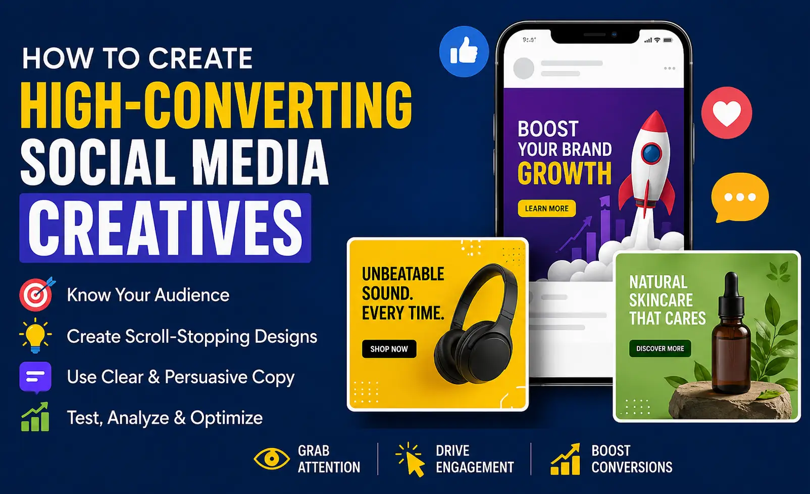
Introduction
Social media feeds are battlegrounds for attention. The average person scrolls through approximately 300 feet of content every day the equivalent of the Statue of Liberty, twice over. In this environment, your creative content has approximately 1.7 seconds to earn a pause before it is consigned to the scroll. If it earns that pause, it has 3-5 seconds to make someone interested enough to read further, watch on, or take action.
High-converting social media creatives do not happen by accident. They are the result of strategic thinking about audience psychology, platform-specific creative norms, visual hierarchy, and clear call-to-action design combined with disciplined creative execution and data-driven iteration. This guide gives you the framework and the practical tools to produce creatives that perform.
Understanding the Platform Context
The most fundamental principle of social media creative design is platform specificity. Different platforms have radically different creative norms, audience expectations, and technical requirements. Content that performs brilliantly on one platform may perform poorly on another not because of quality differences but because of context misalignment.
The Anatomy of a High-Converting Creative
Element 1: The Hook Your 1.7-Second Audition

The hook is whatever stops the scroll. In video, it is the first frame and first moment of audio. In static images, it is the primary visual element or the headline text. In carousels, it is the first slide.
Proven hook strategies:
Bold visual contrast: a striking image, an unexpected color combination, or a dramatically simple composition that stands out in a busy feed
Strong opening text: a provocative question, a bold claim, a surprising statistic, or a direct address to the viewer's specific pain point
Pattern interrupt: something that visually breaks the expected pattern of the feed an unusual perspective, an unexpected context, a striking graphic treatment
Familiar + unexpected: something that looks recognisable but has an element that is unexpectedly different, triggering curiosity
Direct eye contact: when a human face in a photo makes direct eye contact with the viewer, it creates an instinctive social attention response
Element 2: The Message - What You Need Them to Understand

Once you have earned the pause, your message must communicate quickly and clearly. Social media audiences do not invest effort in decoding complex messages clarity is not a creative compromise, it is a performance requirement.
Message clarity principles:
One primary message per creative: attempting to communicate multiple things simultaneously reduces the effectiveness of all of them
Lead with the benefit, not the feature: 'Sleep better tonight' outperforms 'Contains 5mg melatonin and L-theanine'
Use your audience's vocabulary: the words and phrases your ideal customer uses to describe their problem and desire are the most persuasive words in your message
Minimum viable text: every word that is not earning its place on a social creative should be cut brevity is a virtue in every social media format
Element 3: Visual Hierarchy - Guiding the Eye

Visual hierarchy is the intentional organisation of design elements so that the viewer's eye naturally moves through the creative in the sequence you intend from hook to message to call to action. Hierarchy is established through:
Size: larger elements are seen first
Color and contrast: high-contrast elements attract the eye before low-contrast ones
Position: elements at the top-left of a composition (in left-to-right reading cultures) are processed first
Isolation: an element surrounded by white space attracts more attention than one crowded by other elements
Weight: bold type reads before regular weight; brighter colors before muted ones
Element 4: Brand Consistency - Building Recognition
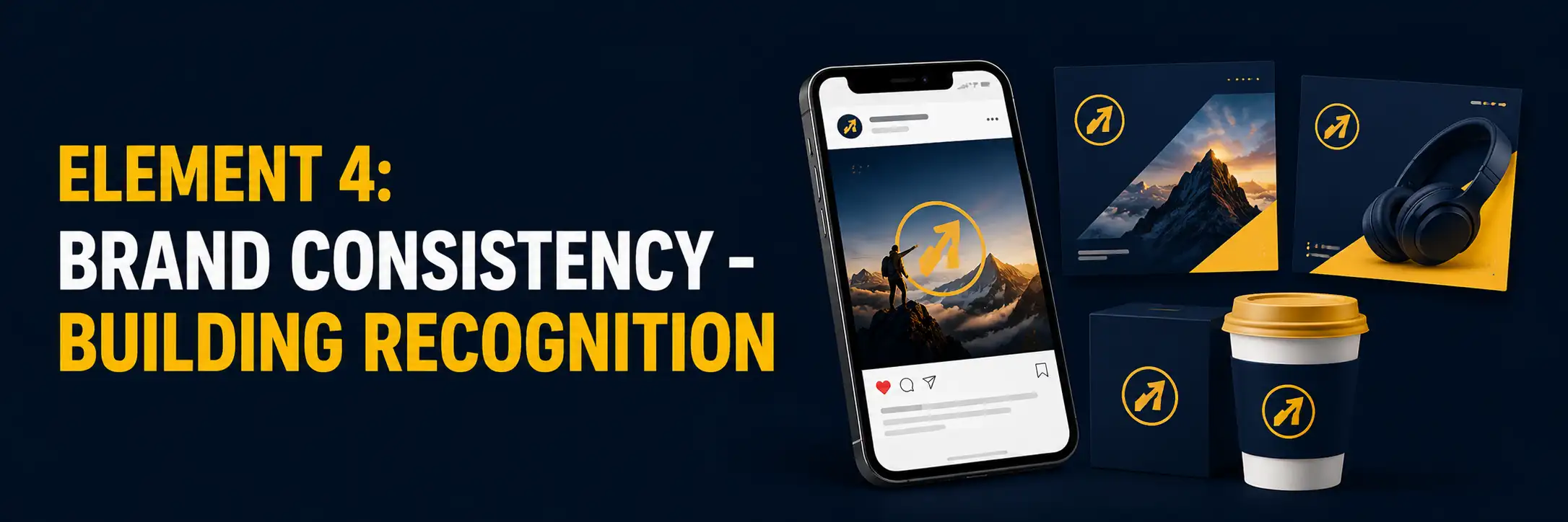
Every creative you produce is also a brand impression. Consistent use of brand colors, typography, logo placement, and visual style across all social content builds the cumulative recognition that makes audiences instantly identify your content in their feed a significant organic reach advantage as the algorithm increasingly learns that your content is relevant to people who engage with it.
Practical consistency tools:
Create a library of branded content templates in Figma, Canva, or Adobe Express
Establish a consistent logo placement zone in all creative templates
Define the color palette and typography hierarchy for social content specifically
Create a visual tone guidelines document for social imagery
Element 5: Clear Call to Action

A creative without a clear call to action is content without a destination. Every social creative should have a primary desired action and that action should be made obvious.
CTA principles:
One CTA per creative multiple competing CTAs reduce the likelihood of any single action being taken
Make it specific: 'Shop the collection' > 'Learn more' > 'Click here'
Create urgency where genuine: limited-time offers, limited availability, early-bird pricing
Match the CTA to the audience's stage in the customer journey awareness-stage content needs a 'discover' CTA, not a 'buy now' CTA
On paid creative, ensure the CTA in the ad matches the CTA on the landing page to reduce cognitive dissonance
Creative Specifications by Platform
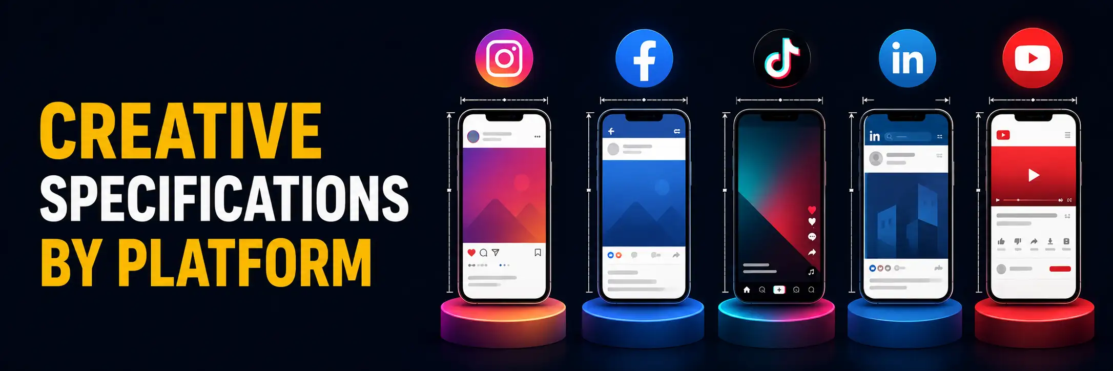
Static Image Best Practices
Design for mobile-first viewing the majority of social media is consumed on mobile screens
Keep critical elements (text, logo, key visual) away from the edges, which may be cropped on different devices
Test your creative at thumbnail size if the key message is illegible at small scale, it will be missed by most viewers
Ensure text-to-image ratio is appropriate for the platform (Facebook/Instagram ads have no longer enforce the 20% text rule but less text generally performs better)
Include accessible alt text descriptions for screen reader users
Video Creative Best Practices
Open with your strongest image YouTube and Instagram show the first frame as a static thumbnail before play begins
Include captions/subtitles 85% of Facebook video is watched without sound; subtitles increase view time significantly
Keep videos as short as the message allows attention data consistently shows front-loaded dropoff
Vertical video (9:16) for mobile-native platforms (TikTok, Reels, Stories); horizontal (16:9) for YouTube and LinkedIn
Introduce your key message within the first 3 seconds before platform 'skip' options appear
Carousel Creative Best Practices
First slide is the hook it must earn the swipe
Create a visual thread that rewards swiping a narrative arc, a progressive reveal, or a consistent stylistic identity across all slides
Use the final slide as a landing pad with your CTA Instagram carousels loop, so the last slide is also shown to those who scroll past the first without swiping
LinkedIn document carousels (PDF format) consistently outperform standard image carousels for B2B educational content
A/B Testing Your Creatives

Even experienced designers with strong strategic instincts are surprised by performance data. A/B testing running multiple creative variants against each other to identify which performs best is the discipline that separates guesswork from evidence-based creative strategy.
Effective A/B testing for social creatives:
Test one variable at a time: changing the headline, the hero image, the CTA, or the color but not multiple elements simultaneously gives you clean data on what is driving performance differences
Ensure statistical significance before drawing conclusions small sample sizes produce unreliable results
Test with sufficient budget: an A/B test with a ₹500 total spend will not produce reliable results
Document learnings: build a running record of what has tested well and poorly for your specific audience, and apply these insights to future creative development
Expand winning elements: when a specific hook, CTA, or visual treatment consistently outperforms, build it into your broader content strategy
Content Pillars: Building a Consistent Content Strategy

High-converting individual creatives exist within a broader content strategy. Defining content pillars 4-6 thematic categories that all your social content falls into provides creative structure, ensures content variety, and prevents the entropy that leads brands to post randomly and inconsistently.
Example content pillar framework for a B2C brand:
Education: content that teaches your audience something valuable related to your product category
Inspiration: content that connects your brand to the aspirational identity of your audience
Community: content that celebrates your customers, shares user-generated content, and builds belonging
Behind the scenes: content that shows the human story behind the brand people, process, and values
Promotion: direct commercial content offers, new products, services kept to a minority of total content (typically 20% or less)
Conclusion
High-converting social media creatives are the product of systematic thinking and disciplined creative execution. They are designed with deep understanding of platform context, audience psychology, visual communication principles, and brand strategy and they are continuously refined through rigorous testing and performance analysis.
The competitive advantage in social media creative is not access to expensive tools or infinite budgets it is strategic intelligence applied consistently over time. Brands that commit to understanding what works for their specific audience, building repeatable systems for producing high-quality content at scale, and continuously testing and learning are the ones that achieve compounding social media performance.

Comments