
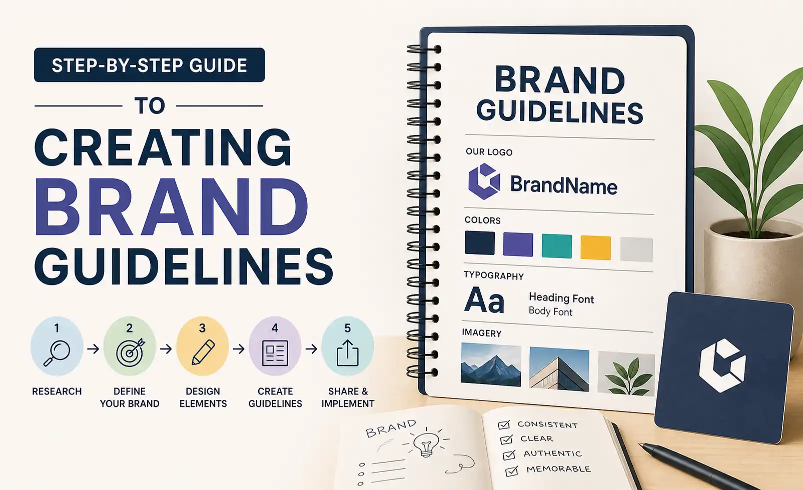
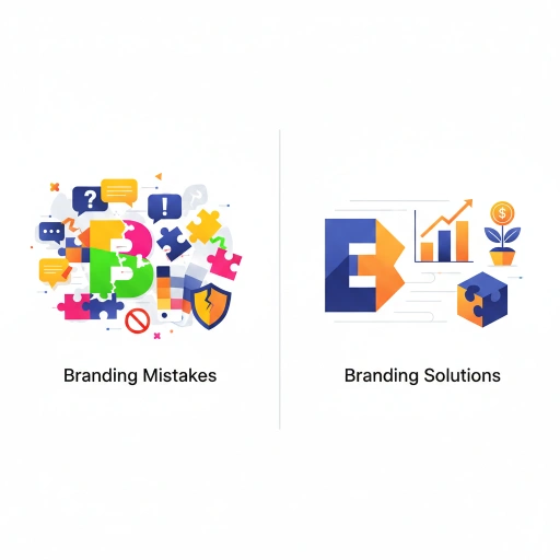
Introduction
Brand guidelines also called brand style guides, brand bibles, or brand standards documents are the single most important piece of documentation any brand can produce. They are the instruction manual for your brand: the reference document that tells every designer, writer, developer, agency, printer, and team member exactly how to represent your brand correctly.
Without brand guidelines, even the most thoughtfully crafted brand identity begins to drift immediately. Different team members use different logo versions. Colours vary from material to material. Typography is chosen based on individual preference. Messages diverge across channels. The result is brand dilution and the slow erosion of the distinctive, consistent identity that builds recognition and trust.
With comprehensive, well-maintained brand guidelines, your brand can be represented consistently by anyone, anywhere, at any time preserving and building the brand equity you have invested in creating.
What Brand Guidelines Should Contain
The scope and depth of brand guidelines varies with the size and complexity of the brand. A startup's brand guidelines may be a ten-page PDF; a global enterprise's brand standards may run to hundreds of pages across multiple documents. What matters is not volume but completeness and clarity every element that could be applied inconsistently should be specified.
Core sections of effective brand guidelines:
Brand foundation (strategy, purpose, values, personality)
Logo system and usage rules
Color palette with technical specifications
Typography system with hierarchy and usage rules
Imagery guidelines
Brand voice and tone guidelines
Layout and design principles
Application examples across key touchpoints
Template library
Let's work through each section in practical detail.
Section 1: Brand Foundation

Brand guidelines should open with the strategic context that everything else serves. This is not filler, it is essential context that helps any creative contributor understand the 'why' behind every specification that follows.
Include:
Brand story: a concise, compelling narrative about how and why the brand was created and what it exists to do
Mission statement: what your brand does and for whom
Vision statement: the future your brand is working toward
Brand purpose: the fundamental reason your brand exists beyond profit
Brand values: your 4-6 core values with behavioural descriptions that make them actionable
Brand personality: the 5-7 adjectives that describe your brand's character, ideally with brief explanatory notes
Target audience: a clear description of who your brand serves their characteristics, needs, and values
This section should be written in your brand voice, not in corporate boilerplate. It should feel like the brand is introducing itself.
Section 2: Logo System
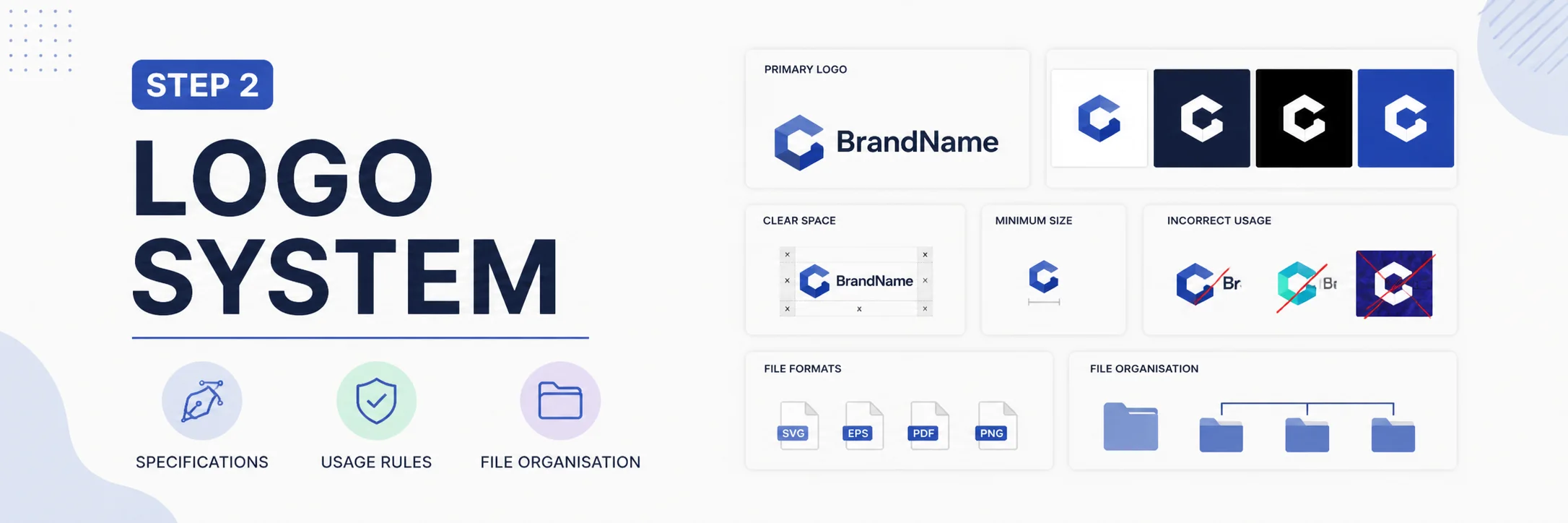
Logo specifications are the most critical section for preventing brand inconsistency. This section must be exhaustive in its specification and illustrated with clear visual examples of both correct and incorrect usage.
What to Include
The primary logo in all approved color variations (full color, black, white/reversed, single-color)
Secondary logo variants (stacked vs. horizontal, icon-only, wordmark-only)
Size minimums the smallest dimensions at which each logo variant can appear and remain legible
Clear space rules the minimum protected space that must always surround the logo (typically expressed as a multiple of a specific design element, such as 'the height of the letterform X on all sides')
Approved background colors and textures specifying which backgrounds the logo may appear on in each color variation
Incorrect usage examples a 'What not to do' panel showing common errors: stretching, recoloring, adding effects, rotating, using on conflicting backgrounds
File format guidance which file type to use in which application (SVG for web, EPS/PDF for print, PNG for general digital use)
File Organisation
Provide a clearly organised logo file package as part of the guidelines deliverable, structured so that any user can quickly find the file they need: organised by color variant, then by file format.
Section 3: Color Palette
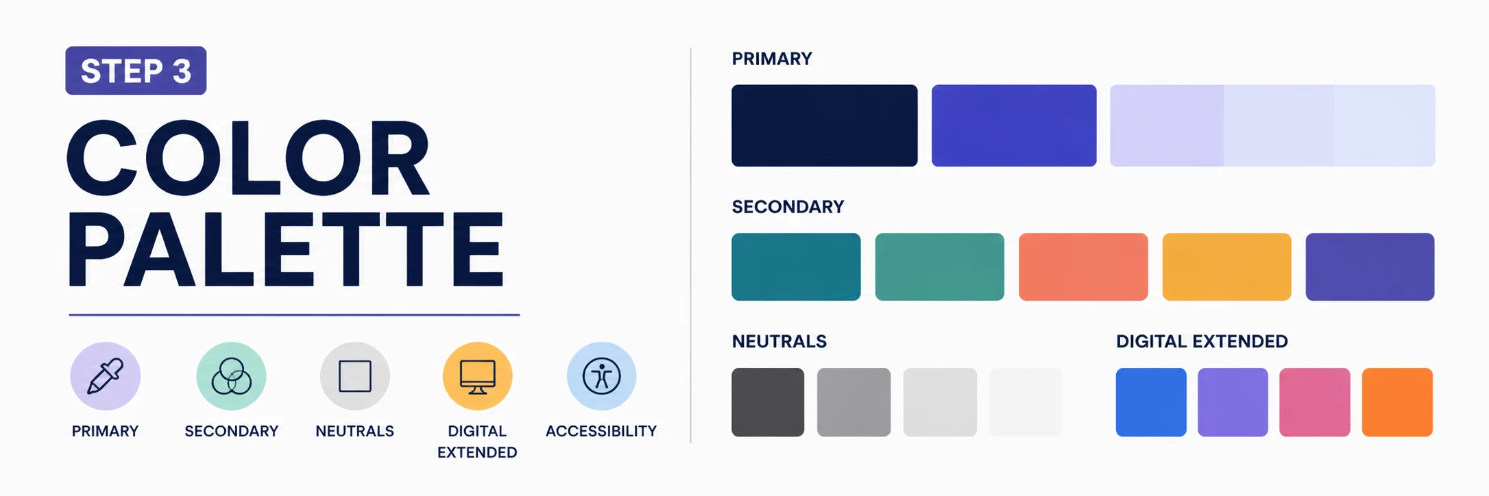
Color specifications must be comprehensive enough to enable accurate reproduction in any medium. For each color in your palette, specify:
Pantone (PMS) code: for physical print matching the universal reference standard for physical color
CMYK values: for process (four-color) printing
RGB values: for digital screen applications
HEX code: for web and digital design applications
RAL or NCS code (if relevant): for physical materials like signage, merchandise, or painted surfaces
Organise your palette clearly:
Primary brand color(s): the most dominant, most frequently used presented prominently
Secondary/accent colors: supporting palette, with usage proportions indicated
Neutral colors: background and supporting tones
Digital-only extended palette: any additional colors used specifically in digital contexts
Include usage guidance specifying the approximate proportional use of each color (e.g., 'Primary blue: 60% of color usage; Accent orange: 25%; Neutrals: 15%').
Include accessibility notes specifically which color combinations meet WCAG 2.1 contrast requirements for text use, and which do not.
Section 4: Typography System
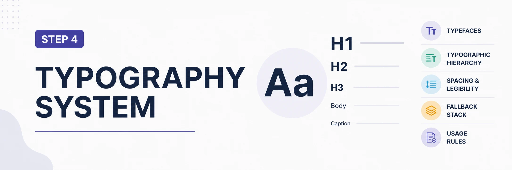
Typography specifications should cover:
Primary typeface: name, foundry, licensing information, approved weights and styles
Secondary/body typeface: same information
Typographic hierarchy: the specific sizes, weights, and spacing for each level of hierarchy (H1, H2, H3, body, caption, label) for both digital and print contexts
Line height and letter spacing specifications for each hierarchy level
Digital fallback stack: the system font hierarchy to use when custom fonts are unavailable
Usage rules: which typeface is used in which contexts, and any restrictions on use
Include visual examples showing the full typographic hierarchy applied to representative content, in both digital and print contexts.
Section 5: Imagery Guidelines
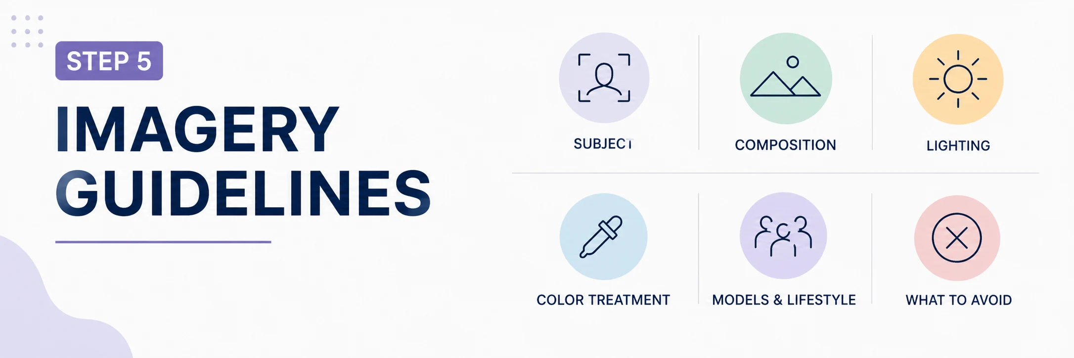
Imagery guidelines define the visual world your brand inhabits. Without clear guidance, photography and illustration choices vary wildly between team members and agencies, creating a fragmented and inconsistent visual identity.
Photography guidelines should specify:
Subject matter: what is appropriate to photograph, and what is not
Composition: preferred framing, perspective, depth of field, negative space
Lighting: the quality, direction, and color temperature of light (e.g., 'bright, natural light with soft shadows' vs. 'dramatic, directional lighting with high contrast')
Color treatment: any colour grading, filtering, or processing applied consistently to brand photography
Model and lifestyle guidelines: if people appear, the diversity, style, and attitude that reflects brand personality
What to avoid: specific styles, subjects, or treatments that are off-brand
Illustration guidelines (if applicable) should specify the style, technique, line weight, color palette application, and appropriate use contexts for any illustrative elements in the brand system.
Section 6: Brand Voice and Tone
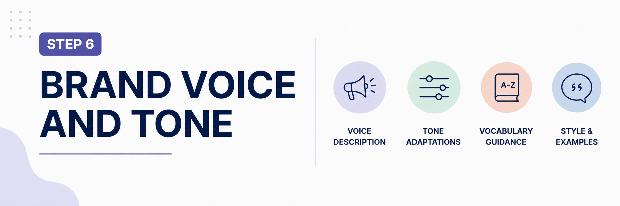
Brand voice guidelines are frequently omitted from style guides a significant oversight. This section should cover:
Voice description: the character and personality that should come through in all written communication
Tone adaptations: how the core voice adjusts for different contexts (e.g., more formal in legal communications, warmer and more conversational in social media)
Vocabulary guidance: words and phrases that are on-brand, and those that should be avoided
Punctuation and style preferences: whether you use Oxford commas, how you handle numbers, how you capitalise product names, etc.
Before/after examples: show the same message written off-brand and on-brand to make the guidance concrete and actionable
Section 7: Layout and Design Principles
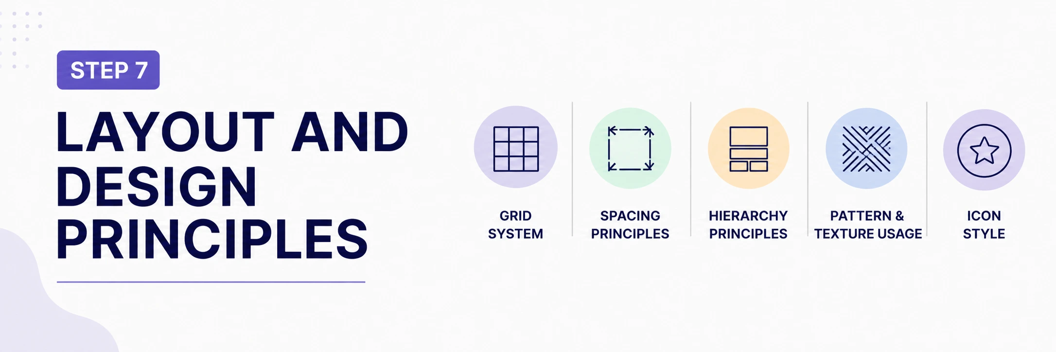
This section provides the compositional logic that guides how brand elements are arranged together. Include:
Grid system: the underlying layout structure that organises content in digital and print contexts
Spacing principles: how white space is used, minimum spacing between elements
Hierarchy principles: how visual hierarchy is established within compositions
Pattern and texture usage: if your brand uses decorative patterns or textures, specify their use
Icon style: the visual style for any icon sets used within the brand system
Section 8: Application Examples
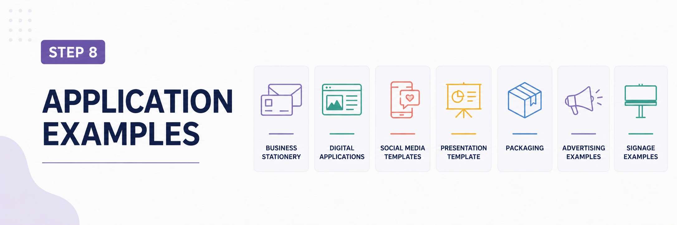
Application examples bring the abstract specifications to life by showing how the brand identity looks when applied to real materials. Include examples across the most common touchpoints:
Business stationery (business cards, letterhead, envelopes)
Digital applications (website header, social media profiles, email signature)
Social media content templates
Presentation template
Packaging (if applicable)
Advertising examples (digital and physical)
Signage examples
These examples serve both as inspiration for creators and as benchmarks against which new work can be assessed for consistency.
Section 9: Template Library

Providing ready-to-use templates for the most common brand communication formats dramatically reduces the risk of inconsistency and saves time for team members who produce brand materials regularly.
Recommended templates to include:
Microsoft PowerPoint or Google Slides presentation template
Microsoft Word or Google Docs document template
Email signature HTML
Social media content templates (sized for each primary platform)
Print advertisement templates in common formats
Business card and stationery print-ready files
Maintaining and Evolving Brand Guidelines
Brand guidelines are not a set-and-forget document. They should be:
Version-controlled: each update should have a version number and date, with a change log
Accessible: stored in a location where all relevant team members and agencies can find the current version at any time
Actively enforced: brand guidelines only work if someone is accountable for ensuring they are followed
Periodically reviewed: a formal brand guidelines review should be conducted at least annually, and whenever a significant brand evolution occurs
Supplemented with onboarding: new team members and new agency relationships should include a brand guidelines briefing
Conclusion
Brand guidelines are the infrastructure that enables a brand to scale. They ensure that the investment made in creating a distinctive, coherent brand identity is protected and preserved as the business grows, new people join the team, and new agencies and suppliers come on board. A well-constructed and actively maintained brand guidelines document is not an administrative expense it is a strategic asset.
The effort invested in creating comprehensive guidelines pays dividends every time any piece of brand communication is produced. Consistently applied brand guidelines mean less rework, fewer errors, faster creative production, and a stronger cumulative brand effect in the market.
.png)

Comments