
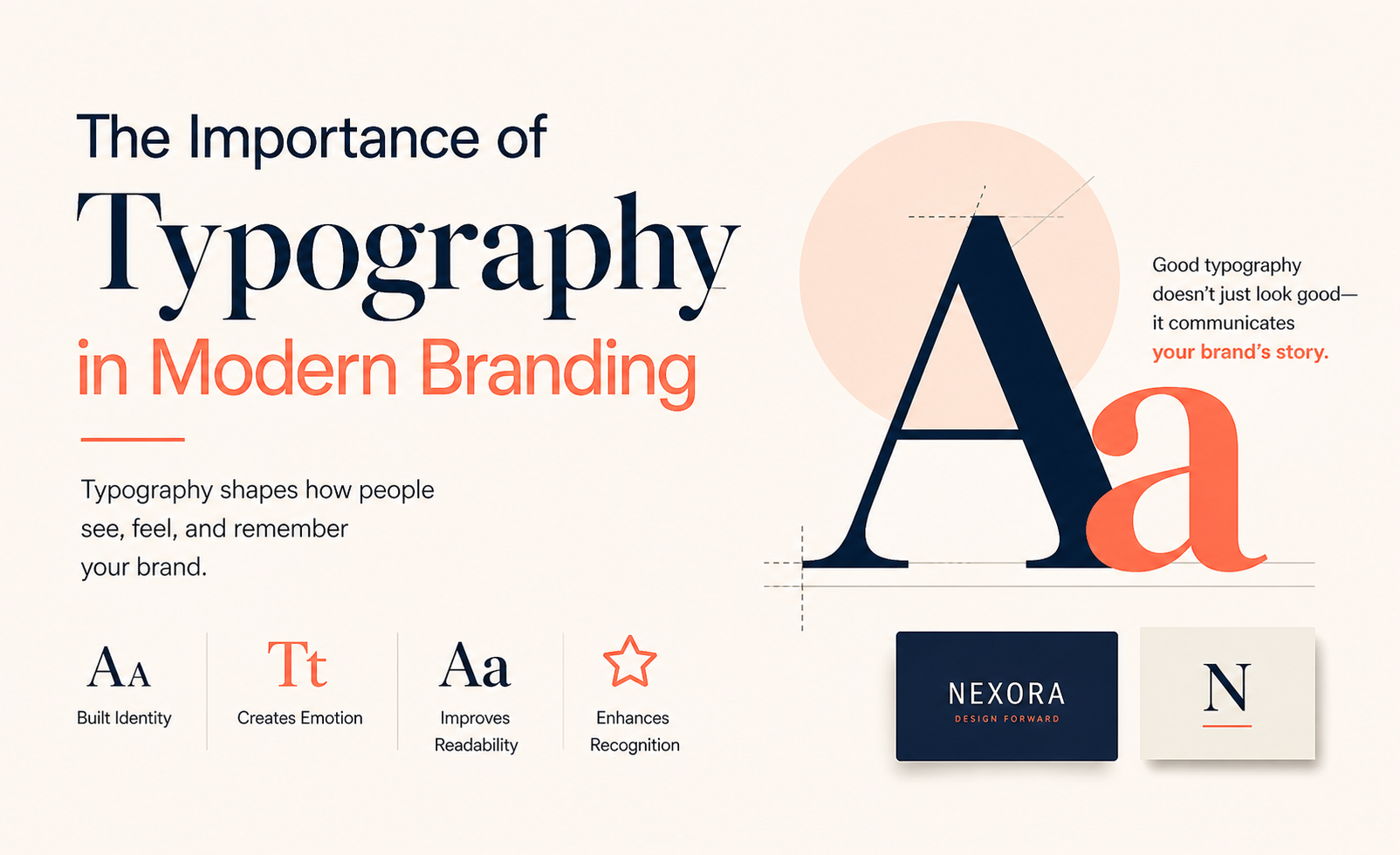
Introduction
Typography is the silent communicator. Before a reader processes the meaning of a single word, the typeface in which those words are set has already communicated something about the brand: whether it is serious or playful, traditional or contemporary, premium or accessible, confident or understated. This pre-cognitive communication happens in milliseconds and shapes the emotional context within which all subsequent information is received.
Yet typography remains one of the most undervalued and misunderstood elements of brand identity. Many small business owners treat typeface selection as a purely aesthetic decision choosing fonts that they personally find attractive rather than strategically selecting typefaces that express the brand personality they want to project and that function effectively across all the contexts in which the brand will appear.
This guide will give you both the conceptual foundation and the practical tools to make typography a genuine strategic asset in your brand identity.
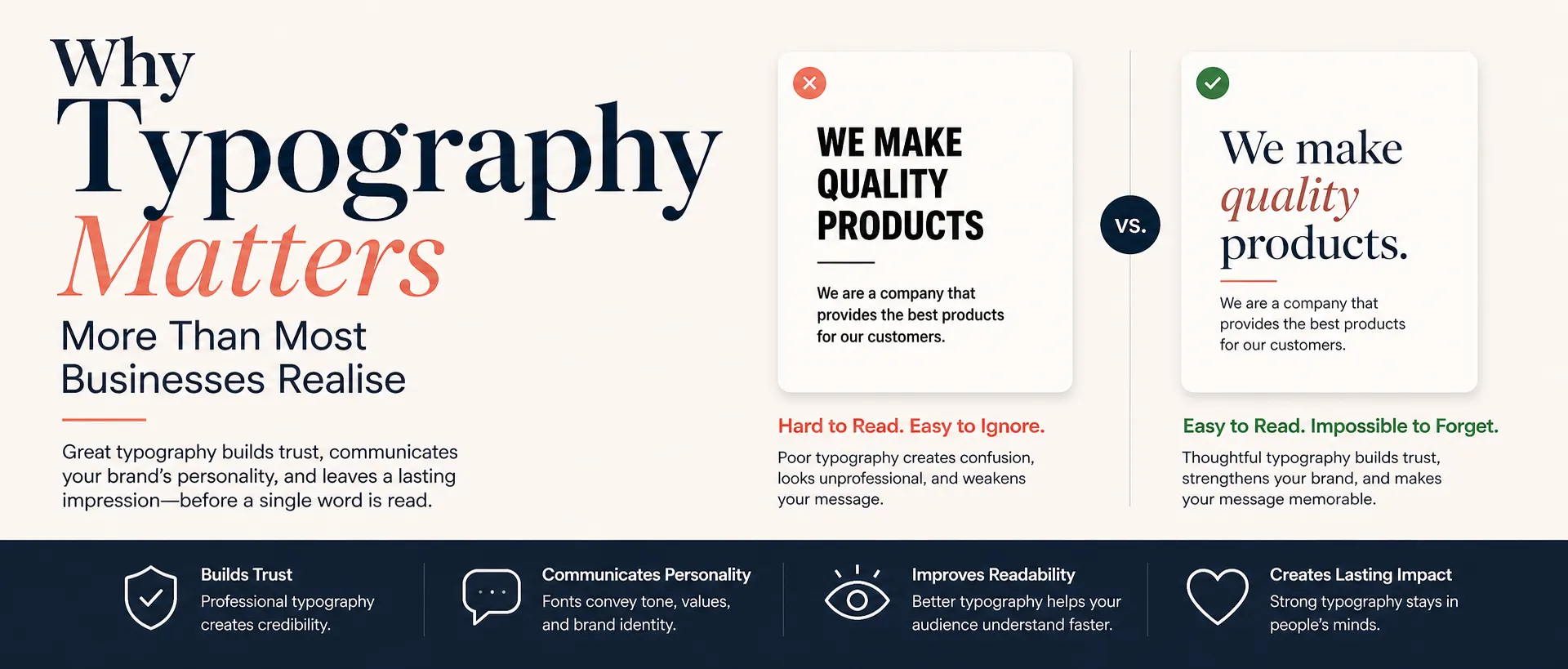
Why Typography Matters More Than Most Businesses Realise
Typography as Personality Expression
Every typeface has a personality. A serif typeface like Garamond communicates tradition, authority, and refinement; it has been used by publishers and institutions for centuries and carries those associations. A geometric sans-serif like Futura communicates modernity, precision, and forward-thinking rationalism. A hand-lettered script suggests warmth, craft, and personal authenticity. A condensed grotesque sans-serif projects energy, urgency, and no-nonsense directness.
When you choose typefaces for your brand, you are choosing the personality that every word you publish will wear. This is not a minor aesthetic decision it is a fundamental expression of brand identity.
Typography and Perceived Quality
Poor typography mismatched typefaces, inappropriate sizes, insufficient contrast, bad kerning, crowded leading signals, poor attention to detail and undermines perceived quality, regardless of the quality of the product or service being sold. Conversely, sophisticated typography, harmonious combinations, refined spacing, confident hierarchy signals quality before a word is read.
Research in consumer psychology consistently shows that the quality of typography in branded materials significantly influences perceptions of product quality and brand trustworthiness. Consumers cannot always articulate why they trust one brand's materials more than another's but typography is frequently the operative variable.
Typography and Brand Recognition
Distinctive, consistently applied typography is one of the most powerful brand recognition tools available. Many iconic brands are instantly recognisable from their typography alone, without any other visual element:
Vogue's bold, condensed Didot serif is as much the magazine's brand as its cover photography
Google's Product Sans (a custom typeface) is instantly identifiable as Google even without the color or logo
Disney's lettering style is so distinctive that it constitutes the brand identity more powerfully than any symbol could
Coca-Cola's Spencerian script has remained essentially unchanged for over 130 years and is one of the most recognised visual elements in commercial history
Understanding Type Classifications
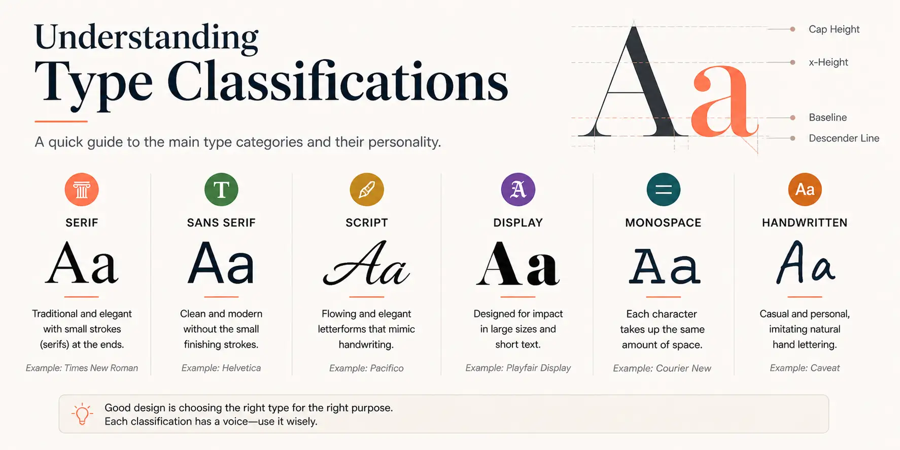
Serif Typefaces
Serif typefaces have small decorative strokes (serifs) at the ends of letterform strokes. They are typically associated with tradition, authority, trustworthiness, and sophistication. Serif fonts are widely used by financial institutions, legal firms, luxury brands, publishers, and academic institutions.
Serif subcategories:
Old-style serifs (Garamond, Caslon): humanist, warm, traditional excellent for editorial and brand applications requiring approachable authority
Transitional serifs (Times New Roman, Baskerville): balanced, refined, serious strong for professional services and publishing
Modern serifs (Bodoni, Didot): high-contrast, dramatic, elegant associated with luxury fashion and editorial contexts
Slab serifs (Rockwell, Clarendon): bold, confident, sturdy effective for brands wanting strength and impact with a traditional foundation
Sans-Serif Typefaces
Sans-serif typefaces lack the decorative strokes of serifs. They are generally associated with modernity, clarity, accessibility, and clean design. Sans-serifs dominate technology, consumer, and digital-native brand identities.
Sans-serif subcategories:
Grotesque sans-serifs (Helvetica, Aktiv Grotesk): neutral, universal, workmanlike effective for brands prioritising clarity and contemporary appeal
Geometric sans-serifs (Futura, Circular): precise, rational, modern popular with technology and design-forward brands
Humanist sans-serifs (Gill Sans, Optima): warmer and more characterful bridges the gap between serif expressiveness and sans-serif modernity
Neo-grotesque sans-serifs (Inter, DM Sans): highly functional and legible, developed specifically for digital interfaces
Script and Display Typefaces
Script typefaces replicate the look of handwriting or calligraphy. They convey warmth, personality, creativity, and craft. They are effective for artisanal, beauty, wedding, hospitality, and luxury brands but must be used with care; they are typically suitable for display use only and become illegible at small sizes or in long passages.
Display typefaces are designed specifically for large-scale, high-impact applications. They are often distinctive to the point of being recognisable in their own right, but their distinctive character makes them unsuitable for body text use.
Building a Brand Typography System
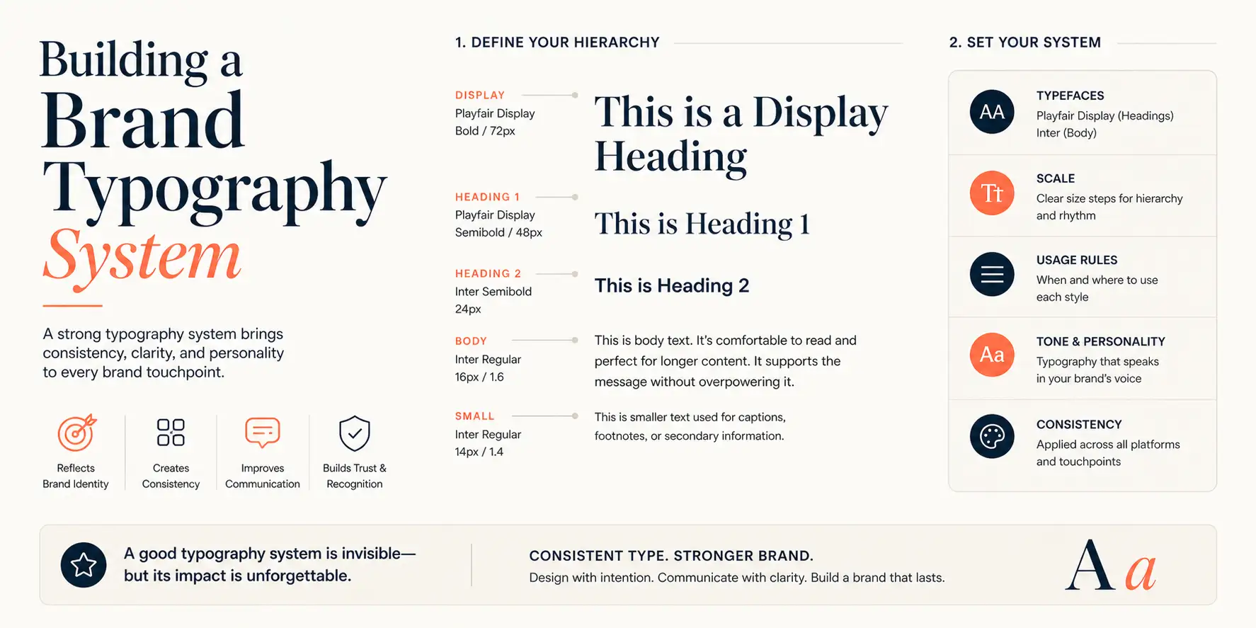
Primary Brand Typeface
Your primary brand typeface carries the most weight in defining your brand's typographic personality. It appears in headlines, display applications, and prominent branded materials where typographic expression is most visible and most impactful. Choose it with care:
Does it authentically express your brand personality?
Is it distinctive enough to contribute to recognition without being so unusual that it sacrifices legibility?
Does it function at the full range of sizes it will need to appear at from large display applications down to small subheadings?
Is it available across all the media and applications you need (web fonts, print, variable font for digital)?
Does it have sufficient weights and styles to provide the typographic range you need?
Secondary/Body Typeface
Your secondary typeface handles the functional communication load: body copy, captions, long-form text, interface labels, and supporting text applications. It prioritises legibility and readability over distinctive personality expression. Key requirements:
High legibility at reading sizes (typically 14-18px on screen, 10-12pt in print)
Good x-height (the height of lowercase letters relative to capitals) for strong readability at small sizes
Harmonious pairing with your primary brand typeface not identical but complementary
Available in sufficient weights to support hierarchy within body text (regular, medium, bold at minimum)
Digital-Specific Considerations
Typography in digital contexts has specific requirements that differ from print:
Variable fonts: modern type format that contains multiple weights and styles in a single file, reducing page load time and enabling smooth responsive behaviour
Web font licensing: commercial typefaces require specific web font licenses ensure your font licensing covers all digital applications
Fallback font stacks: define system font fallbacks for situations where custom fonts don't load
Responsive typography: define how type sizes and spacing adapt across screen sizes
Accessibility: minimum contrast ratios, minimum font sizes, and line length guidelines for inclusive reading experiences
Type Pairing Principles
Combining typefaces effectively is one of the most sophisticated skills in typography. Useful principles for brand typography pairing:
Contrast, not clash: pair typefaces that are noticeably different in style but harmonious in underlying proportions. A classic combination is a serif primary with a humanist sans-serif body typeface
Same foundry or designer: typefaces from the same foundry or designed as complementary pairs share underlying structural decisions that make them harmonious
Superfamilies: some type families include both serif and sans-serif variants designed to work together these eliminate pairing risk entirely
Avoid similar but different: two slightly different grotesque sans-serifs used together look like an error, not a choice
Typography in Digital Brand Applications
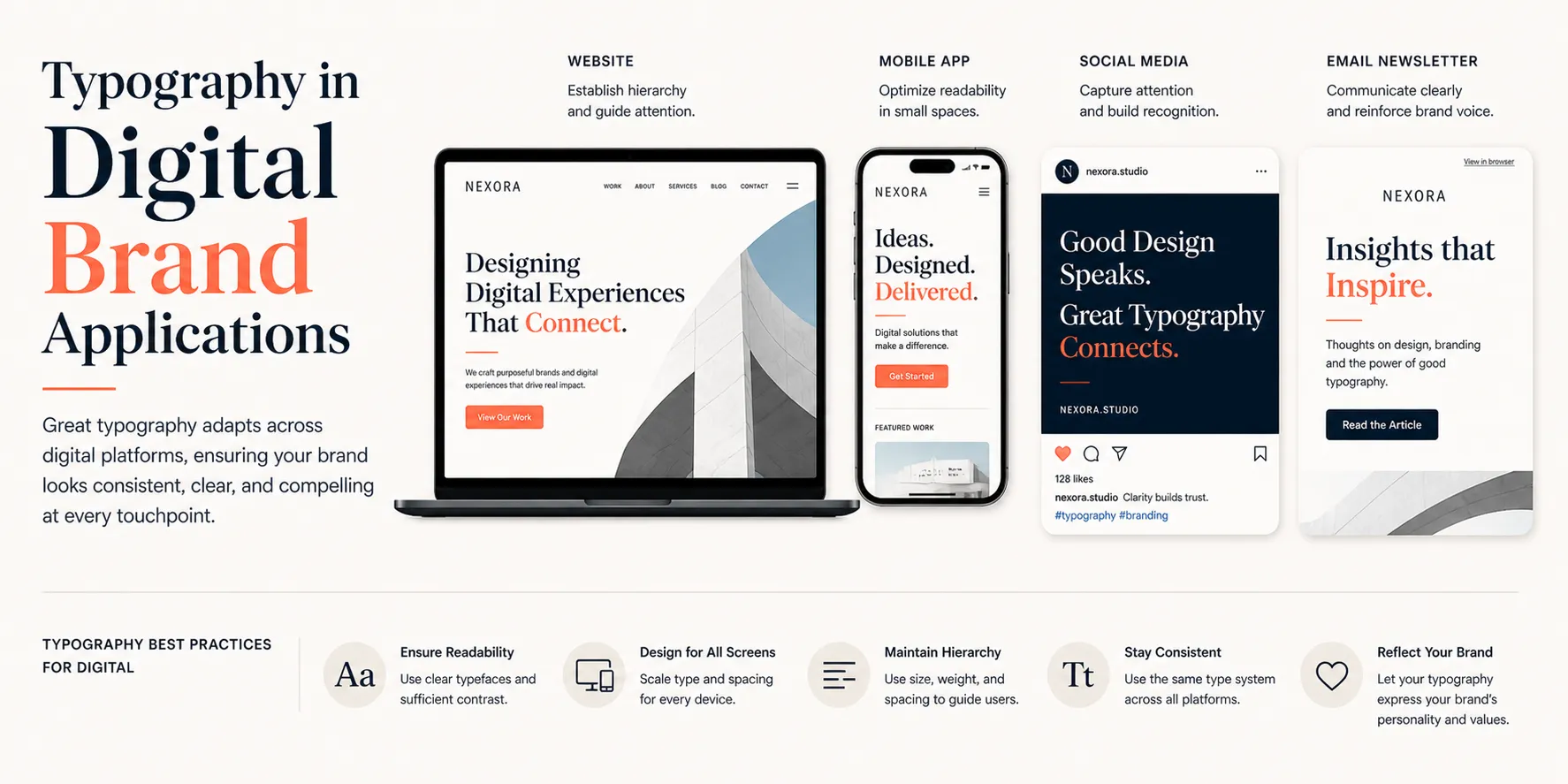
Website Typography
Your website's typography makes or breaks its effectiveness as a brand communication tool. Key principles:
Hierarchy: establish clear typographic hierarchy through size, weight, and style variation — H1 → H2 → H3 → body → caption should each be visually distinct
Line length: optimal line length for comfortable reading is 50-75 characters (approximately 600-800px at standard font sizes). Lines that are too long cause eye fatigue; too short creates an interrupted reading rhythm
Line height: body copy typically reads best at 1.4-1.6x the font size. Headings can be tighter (1.1-1.3x) for a more impactful, display-like feel
Letter spacing: most digital body text benefits from slightly looser letter spacing than print defaults; all-caps text always benefits from increased letter spacing (tracking)
Social Media Typography
Social media graphics have unique typographic challenges content must be readable at thumbnail scale on a mobile screen, often against photographic backgrounds with varying contrast. Effective social typography principles:
Use fewer, larger type elements rather than many small ones legibility at thumbnail scale is the primary criterion
Ensure high contrast between text and background either through color contrast or by adding a translucent background behind text placed over images
Build a template system using your brand typefaces that can be consistently applied to all content formats
Reserve decorative or unusual typefaces for display use body information needs maximum legibility
Responsive Typography
Type sizes and spacing that work perfectly on a desktop screen often need adjustment for mobile. A common approach is fluid typography using CSS clamp() or viewport-relative units to smoothly scale type sizes between minimum and maximum values across the full range of screen sizes.
Typography Mistakes to Avoid
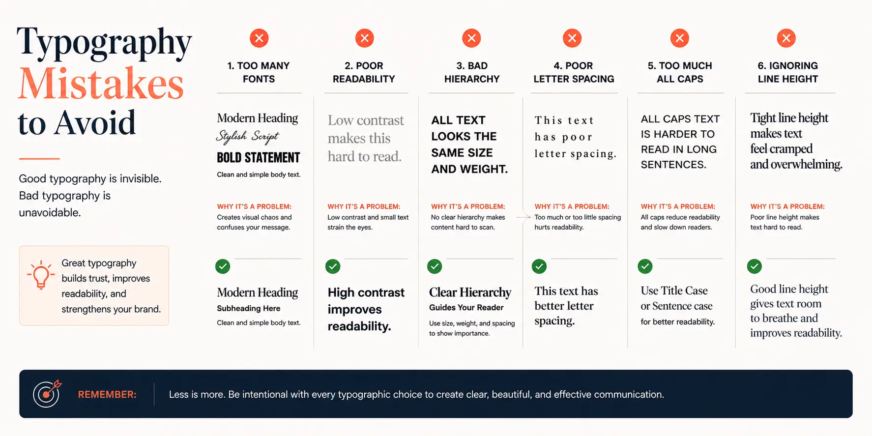
Using too many typefaces: more than 2-3 typefaces in a brand system creates visual noise and prevents recognition
Incorrect apostrophes and quotation marks: using 'straight' quotes instead of 'curly' typographic quotes is an immediately visible mark of typographic inexperience
Widows and orphans: single words on a line at the end of a paragraph (widow) or the beginning of a column (orphan) are typographic errors that should be resolved through copyediting or manual line breaks
Excessive kerning adjustments: poorly adjusted letter spacing creates uneven rhythm that is immediately visible to trained eyes and subtly uncomfortable to untrained ones
Stretching or distorting typefaces: scaling a typeface disproportionately (wider or taller without maintaining aspect ratio) destroys the typographer's carefully calibrated stroke weights and proportions
Using display typefaces at body sizes or body typefaces at display sizes: each typeface category is optimised for specific size ranges
Conclusion
Typography is not a technical afterthought it is one of the most powerful tools in your brand identity system. It shapes personality perception before a word is read, builds recognition through consistency, signals quality through execution, and guides readers through information with clarity and authority.
The brands that take typography seriously investing in distinctive, well-considered typeface choices, applying them with discipline and skill, and evolving them thoughtfully over time have a visual communication advantage that is both subtle and profound.


Comments