
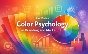
Close your eyes and think of Coca-Cola. Even without the logo, chances are you pictured red. Now think of WhatsApp green appears instantly. Apple? Silver-white minimalism. This is not a coincidence. It is the result of decades of deliberate, scientifically informed color strategy. Color is one of the most powerful and least understood tools in a brand's arsenal and businesses that master it gain a distinct competitive advantage that works on a purely subconscious level.
Research from the University of Loyola, Maryland, found that color alone increases brand recognition by up to 80%. Studies in the Journal of Business Research demonstrate that up to 90% of snap purchasing decisions are made based on color alone. And yet, many small and mid-sized businesses treat color selection as a purely aesthetic decision, choosing shades they find personally attractive rather than strategically selecting the emotional responses they want to trigger.
This guide will change how you think about color. Whether you are building a new brand from scratch, refreshing an existing identity, or designing your next marketing campaign, understanding color psychology will give you tools that work invisibly, continuously, and powerfully.
What Is Color Psychology?

Color psychology is the study of how different hues affect human perception, emotion, and behaviour. Our responses to color are shaped by biology (some reactions are hardwired into our nervous systems), culture (color meanings vary across societies), and personal experience (individual associations formed throughout life).
In branding and marketing, color psychology is applied strategically to:
Create a desired emotional atmosphere around a brand or product
Signal product category and quality level at a glance
Differentiate a brand from competitors
Guide purchasing behaviour and conversion decisions
Build recognition that persists over time and across touchpoints
Importantly, color psychology is not a simple lookup table where red always means one thing and blue always means another. Context, combination, saturation, and cultural background all influence how any given color is interpreted. Effective color strategy requires understanding these nuances, not just memorizing keyword associations.
The Psychology of Individual Colors
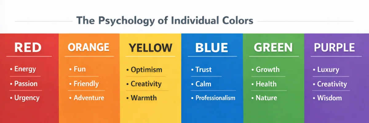
Red: Energy, Urgency, and Passion’
Red is physiologically stimulating; it literally raises heart rate and creates a sense of urgency. In marketing, this makes it powerful for time-limited offers, clearance sales, and fast-food brands (where stimulation encourages quick ordering and turnover). Coca-Cola, Netflix, YouTube, Red Bull, and Target all leverage red's high energy. The risk of red is that overuse creates anxiety rather than excitement, and it can feel aggressive if not balanced carefully.
Red works particularly well for: food and beverage, entertainment, sports, retail promotions, and brands wanting to project passion and boldness.
Blue: Trust, Reliability, and Depth
Blue is the world's most universally liked color and the most commonly used in corporate branding not by accident. Blue triggers associations with stability, competence, calm, and trustworthiness. It is heavily used in finance (Barclays, American Express, Chase), technology (Facebook, LinkedIn, IBM, Samsung, Dell), healthcare, and aviation every sector where trust and reliability are primary brand values.
Darker blues communicate authority and professionalism. Lighter blues suggest approachability and openness. Bright, vivid blues (as used by Facebook and Samsung) feel innovative and contemporary. The primary risk of blue in branding is that it can feel cold and impersonal if not paired with warmer elements.
Green: Nature, Health, and Growth
Green's association with nature, sustainability, health, and prosperity makes it the dominant color in environmental, wellness, organic food, and financial brands. Whole Foods, John Deere, Starbucks, BP (controversially), and Land Rover all use green to signal their respective value propositions around nature, premium experience, or growth.
Lighter, yellower greens feel fresh and natural. Darker, more muted greens feel sophisticated and premium. Bright lime greens feel energetic and youthful. The challenge with green is greenwashing risk consumers are increasingly alert to brands using green imagery without genuine sustainability credentials.
Yellow: Optimism, Warmth, and Attention
Yellow is the most visible color to the human eye and one of the most complex to use in branding. It communicates happiness, warmth, and creative energy but also caution and cheapness if used at the wrong saturation or in the wrong context. McDonald's golden arches, Snapchat's playful yellow, IKEA's affordable cheerfulness, and DHL's high-visibility logistics branding all demonstrate yellow's range.
Gold (a more complex, rich variant) communicates luxury and achievement rather than casual cheerfulness, a critical distinction. Yellow typically works best as an accent or highlight color rather than a dominant brand color, though there are powerful exceptions.
Orange: Enthusiasm, Creativity, and Affordability
Orange occupies an energetic middle ground between red's intensity and yellow's lightness. It projects friendliness, enthusiasm, and accessibility making it popular for brands that want to feel approachable and dynamic without the aggression of red. Amazon's smile, Harley Davidson's warmth, Fanta's fun energy, and easyJet's no-frills accessibility all reflect orange's versatility.
Orange is notably effective for calls-to-action in digital marketing; multiple A/B testing studies have found orange CTAs outperform other colors in conversion rates, particularly in e-commerce contexts.
Purple: Luxury, Wisdom, and Creativity
Purple has deep historical associations with royalty and luxury, a heritage that modern brands deliberately leverage. Cadbury's unmistakable purple chocolate packaging, Hallmark's sophistication, and Anastasia Beverly Hills' premium beauty positioning all use purple to signal elevated quality and creativity. Purple also has strong associations with spirituality and mystery, making it popular in wellness, cosmetics, and creative industries.
The risk with purple is that it can feel dated if not executed with contemporary design sensibility. Electric, vivid purples feel fresh and digital; dusty or traditional purples can feel anachronistic.
Black: Premium, Power, and Elegance
Black is the color of authority, sophistication, and luxury. When used confidently, black signals premium positioning think Chanel, Louis Vuitton, Nike, Apple's marketing photography, and luxury automobile brands. Black creates contrast that makes other colors and shapes more vivid.
The psychological risk of black is that it can feel intimidating, cold, or exclusionary in the wrong context. For brands targeting aspirational but accessible markets, a heavy black palette may create distance rather than desirability.
White: Purity, Simplicity, and Space
White communicates cleanliness, simplicity, and openness, making it central to minimalist design movements and brands that want to signal clarity of purpose. Apple's product design philosophy uses white extensively to suggest technological purity. Medical and wellness brands use it to signal sterility and safety. In combination with other colors, white creates breathing room that gives compositions a sense of quality and confidence.
In many Asian cultures, white is associated with mourning rather than purity a critical cultural consideration for global brands.
Color in Context: Combinations, Contrast, and Culture
Color Combinations and Brand Palette Strategy
Rarely does a brand use a single color in isolation. The relationships between colors in a brand palette create additional layers of meaning:
Complementary colors (opposite on the color wheel, e.g., blue and orange) create high-energy visual tension and excitement ideal for sports and entertainment brands
Analogous colors (adjacent on the color wheel, e.g., blue, teal, and green) create harmony and approachability effective for wellness, lifestyle, and community brands
Triadic combinations (three equally spaced colors) create vibrant, balanced energy popular in children's brands and creative industries
Monochromatic palettes (variations of a single hue) communicate sophistication, confidence, and intentionality common in luxury and technology brands
Cultural Color Considerations
Color meaning is not universal. For global brands, cultural sensitivity in color selection is essential:
Color Psychology in Digital Marketing
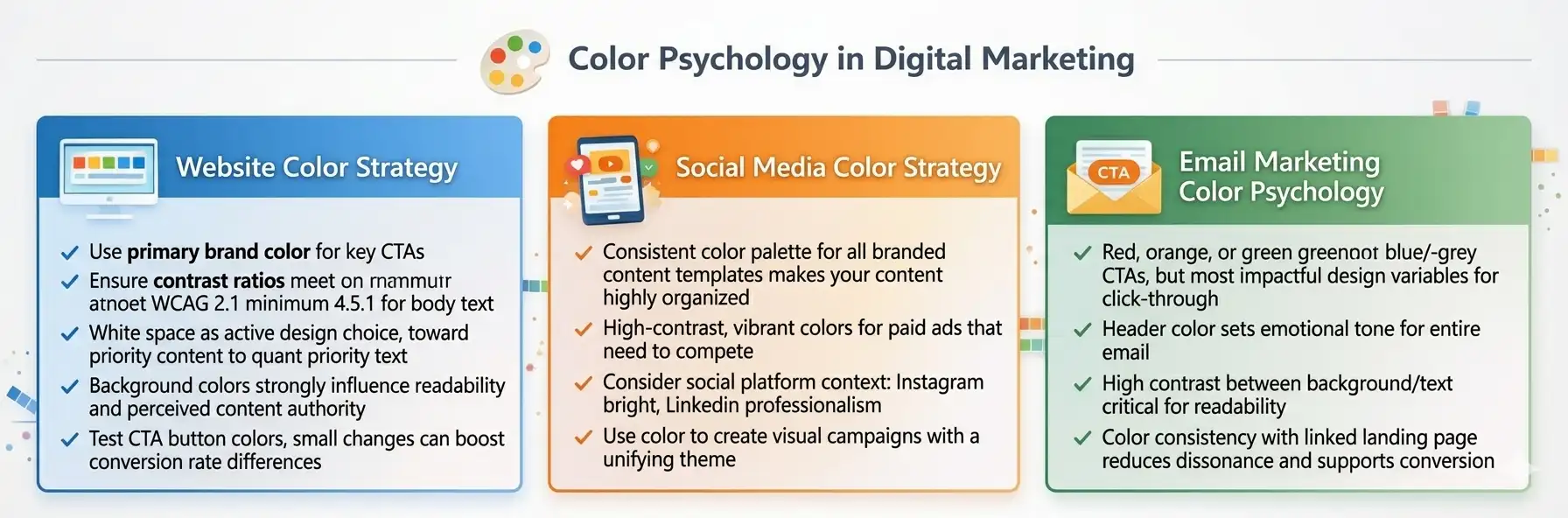
Website Color Strategy
Your website's color palette shapes the visitor's emotional response within milliseconds before a single word is read. Key principles for website color strategy include:
Use your primary brand color for key calls-to-action to build an association between the color and action
Ensure sufficient contrast ratios for accessibility (WCAG 2.1 minimum 4.5:1 for body text)
White space is an active design choice, not an empty gap; use it to guide attention toward priority content
Background colors strongly influence readability and perceived content authority
Test CTA button colors, rigorous small changes can produce 20-30% conversion rate differences
Social Media Color Strategy
On social media feeds, color is one of your most powerful tools for stopping scrolling thumbs. Consistent use of your brand color palette across all organic and paid social content creates immediate recognition users begin to identify your content before reading the caption or seeing the logo.
Practical applications:
Establish a consistent color palette for all branded content templates
Use high-contrast, vibrant colors for paid ads that need to compete for attention
Consider platform context: Instagram rewards aesthetic consistency, LinkedIn rewards professionalism, TikTok rewards creative contrast
Use color to create visual series campaigns with a unifying color theme feel cohesive and professional
Email Marketing Color Psychology
Email marketing research consistently shows that CTA button color is one of the most impactful design variables for click-through rate. Key principles:
CTA buttons in red, orange, and green typically outperform blue and grey in A/B tests, but context matters test against your specific audience and brand
Header color sets the emotional tone for the entire email
High contrast between background and text is critical for readability across all devices and email clients
Color consistency with the linked landing page reduces cognitive dissonance and supports conversion
How to Select Your Brand Color Palette: A Practical Framework
Define your brand personality: Identify 3-5 adjectives that describe how you want customers to feel when they interact with your brand (e.g., trustworthy, playful, sophisticated, energetic, calm)
Research competitor palettes: Map the color territories occupied by your main competitors. Differentiation often means deliberately occupying a different part of the color spectrum a competitive gap can become a strategic opportunity
Identify your primary brand color: This should most strongly reflect your brand personality and be distinctive within your competitive category
Build a supporting palette: Choose 2-4 secondary colors that complement, contrast, and support your primary color. Include at least one neutral (white, black, grey, or beige)
Test across applications: Evaluate your palette on digital screens, print, signage, packaging, and merchandise. Colors behave differently across media
Test with your target audience: Conduct simple preference and association testing with representative members of your target market before committing
Document your color specifications: Record Pantone, CMYK, RGB, and HEX codes for every color in your palette and document usage guidelines
Real-World Case Studies in Color Strategy
Tiffany & Co. - Owning a Color
Tiffany & Co. has so thoroughly owned Robin's Egg Blue (Pantone 1837, named after the year the company was founded) that the color itself has become a luxury signifier independently of any logo. The company has trademarked the specific Pantone shade for use in jewelry retail contexts. When a customer receives a Tiffany Blue box, the emotional response is triggered before it is even opened. This is the ultimate expression of strategic color ownership — a brand asset that operates continuously across every touchpoint.
Cadbury - Defending Purple
Cadbury has fought extensive legal battles to protect its use of Pantone 2685C purple on chocolate packaging because the company understands that this color is a brand asset worth protecting. Consumer research consistently shows that Cadbury's purple triggers immediate brand recognition and premium chocolate associations even without any supporting text or imagery.
Rebranding Failures - The Cost of Color Missteps
Gap's 2010 logo redesign attempted to shift from its established navy blue to a lighter, more contemporary blue with a gradient and was reversed within six days following overwhelming public rejection. Tropicana's 2009 packaging redesign removed its iconic orange-with-straw imagery and was similarly reversed after sales dropped 20% in two months. Both cases demonstrate that established brand colors carry enormous equity that cannot be casually discarded.
Conclusion
Color is not decoration; it is communication. Every color in your brand palette is delivering a continuous, silent message to every person who encounters your brand, working beneath conscious awareness to shape perception, build trust, trigger emotion, and influence decisions. The brands that treat color selection as a strategic discipline informed by psychology, research, competitive analysis, and cultural awareness gain a compounding advantage that grows more powerful over time as color associations deepen with repeated exposure.
Start with intention. Choose colors that align with who you are and what you want your customers to feel. Document them precisely, apply them consistently, and test their impact continuously. Color is one of the few brand investments that keeps paying dividends every single time someone sees your brand, which is every single day.
Frequently Asked Questions
Q: Should I always follow color psychology rules strictly?
Color psychology provides powerful guidelines, but they are not absolute rules. Context, combination, execution quality, and cultural nuance all modify how any color is perceived. Use color psychology as a strategic starting point, then test and refine based on real audience responses.
Q: How many colors should a brand palette have?
Most brand palettes work best with 3-6 colors: a primary brand color, 1-2 supporting accent colors, and 1-2 neutrals. Too few colors limit creative flexibility; too many create inconsistency and visual noise.
Q: Can I use a color that a major competitor already uses?
Using a dominant competitor's primary color is generally a strategic disadvantage iit creates confusion rather than differentiation. However, using a color from a different category leader (e.g., using green in a technology brand because it works for health brands) can be a deliberate positioning choice. Analysis of your specific competitive landscape should guide this decision.
Q: How do I ensure my colors look the same on all devices and in print?
Specify your colors in multiple color systems: HEX and RGB for digital use, CMYK for print, and Pantone (PMS) for precise physical color matching. Include these specifications in your brand guidelines document and communicate them to every designer, printer, and vendor who works with your brand materials.


Comments