
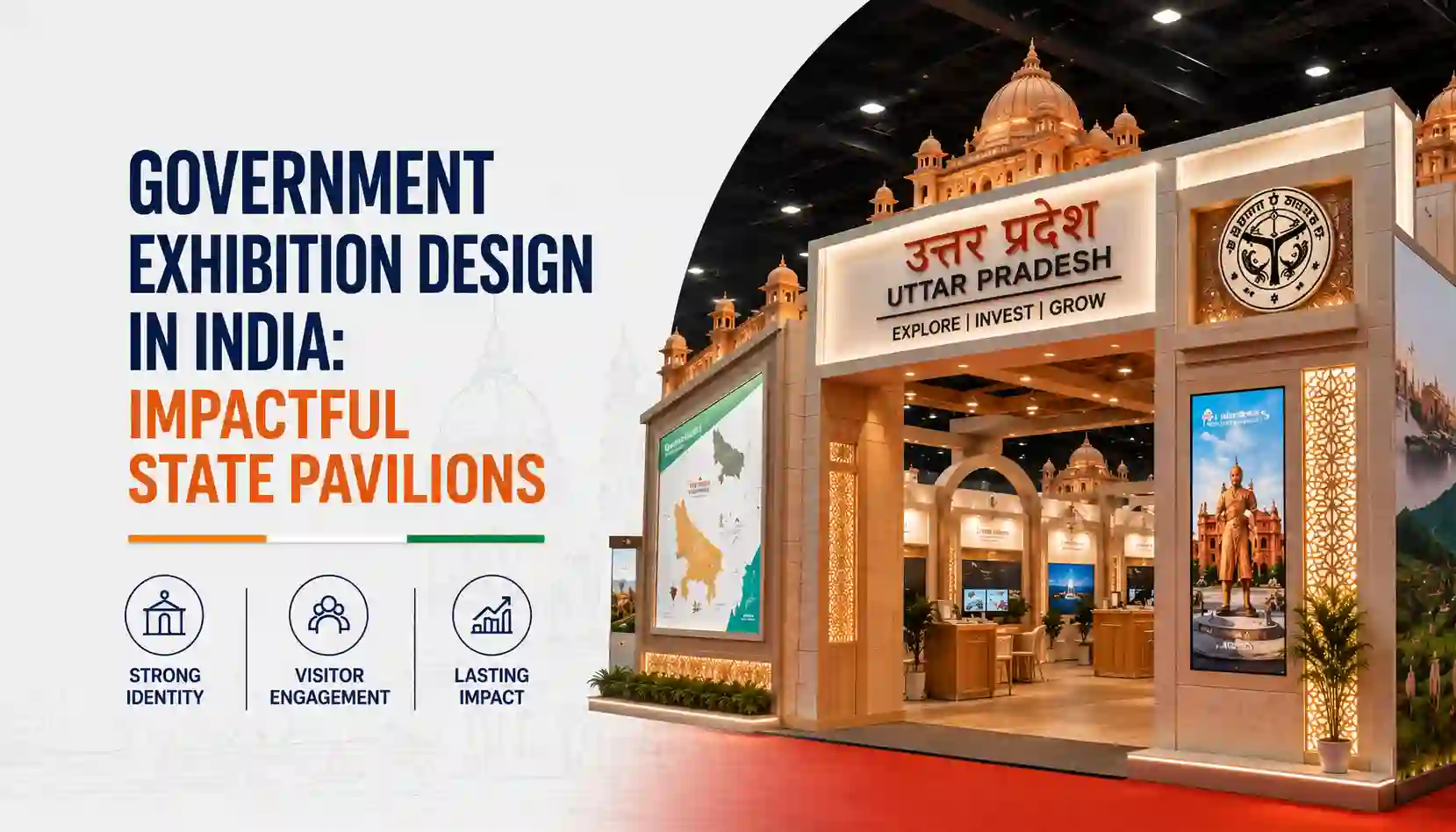
Government exhibitions in India exist in a strange tension. On one hand, they represent some of the most significant public investments in physical communication: India International Trade Fair, state pavilions at national events, ministry-led expos, progressive schemes visualization. On the other hand, many of them are designed as if the primary audience is a compliance checklist rather than an actual person.
You've seen the type: a pavilion filled with statistics on vinyl banners, a physical model of a dam surrounded by no explanation of why it matters, a government scheme explained in the exact bureaucratic language of the scheme document. Technically complete. Experientially inert.
This is a missed opportunity of significant scale.
What Government Pavilions Are Actually Trying to Do
A state pavilion at a national exhibition serves several simultaneous purposes: it represents the state's achievements and identity to a national audience, it communicates schemes and programs to potential beneficiaries and partners, it builds perception of the state as a destination for investment, and it creates media content that amplifies the state's narrative.
None of these purposes is served by a wall of statistics and a brochure rack.
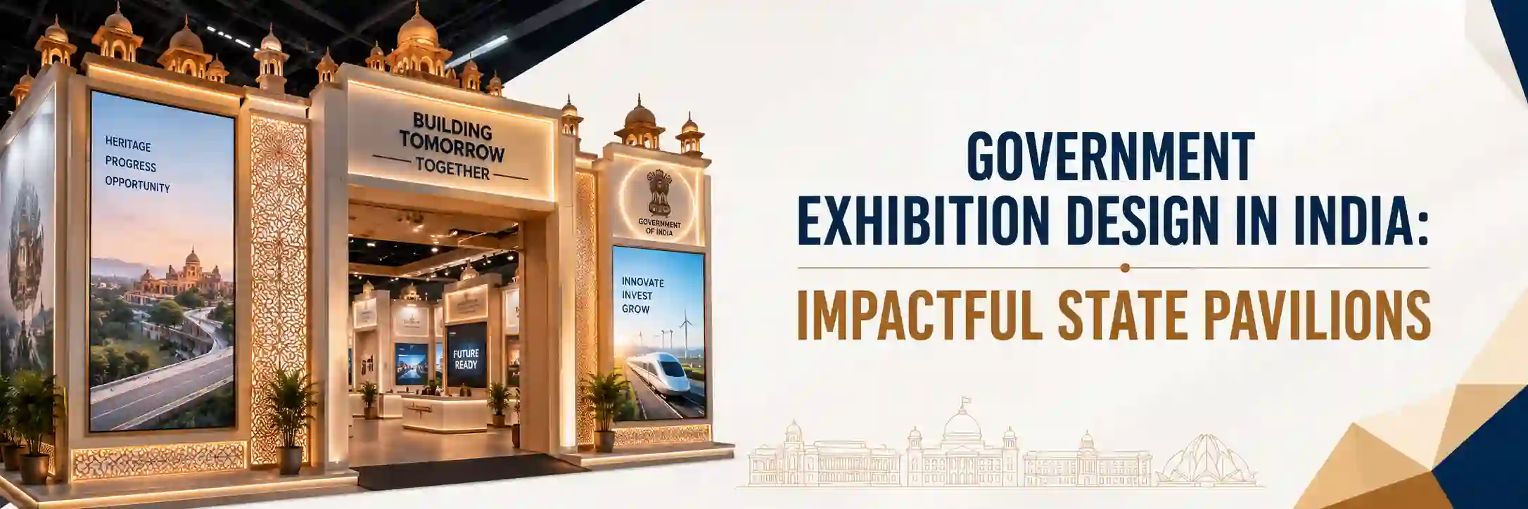
Effective government exhibition design treats the pavilion as a brand communication environment. The state or ministry has an identity, a story, an achievement record, and a vision. The pavilion's job is to translate that into an experience that is comprehensible, emotionally engaging, and memorable.
What Makes a State Pavilion Work

A clear lead narrative
What is the state or ministry saying this year? What is the headline? A pavilion that tries to communicate everything agriculture and manufacturing and tourism and infrastructure and cultural heritage all simultaneously usually communicates nothing clearly. Good government exhibition design picks a theme and builds around it.
Visual storytelling over text density
Data is important. But data on banners, in the sizes and formats typically used, is not how most visitors absorb information. Charts and infographics, photography and illustration, physical models and interactive elements these carry information in more accessible ways.
Physical experiences and interactive elements
Where schemes and achievements can be made tangible through working models, AR/VR demonstrations, product samples, interactive timelines they should be. The difference between telling someone about a water treatment scheme and letting them interact with a scaled visualization of it is significant in terms of what they remember and understand.
Human presence and story
The most powerful elements of any government pavilion tend to be the ones that put a human face on policy. Photographs of beneficiaries, video testimonials, stories of communities that have changed. This is not sentimentality it's effective communication.
Our Experience With Government Exhibition Design

At Swaparichay Studios, we've worked on state pavilions, ministry-led exhibitions, and government sector trade show participations. The work requires a different approach than commercial brand design the content is more complex, the stakeholders are more numerous, and the communication objectives are layered.
But the design principles are the same: start with the audience, define what you want them to understand and feel, and design backward from there.
Moving From Compliance to Engagement
The shift from designing for bureaucratic compliance to designing for real human impact is the next great frontier for public sector communication. When we move past the vinyl banners and walls of text, we unlock the true potential of these spaces to inspire citizens, attract investors, and build lasting national pride. Elevating the standard of Government Exhibition Design in India isn't just about aesthetics—it’s about turning public investments into powerful, memorable experiences that truly connect people with the vision of the state.
.png)

Comments