



About the
Project
TAP-VAL is a leading B2B manufacturer specializing in high-precision industrial valves and flow control solutions. Operating in a technical sector where safety, durability and reliability are critical, they needed a visual identity that reflected their technical authority.
Swaparichay Studios collaborated with TAP-VAL to revitalize their market presence. We created a modern, cohesive brand identity system that translates technical strength into clear visual value helping TAP-VAL stand out in a traditional manufacturing market and build long-term trust with global buyers.
Research
& Discovery
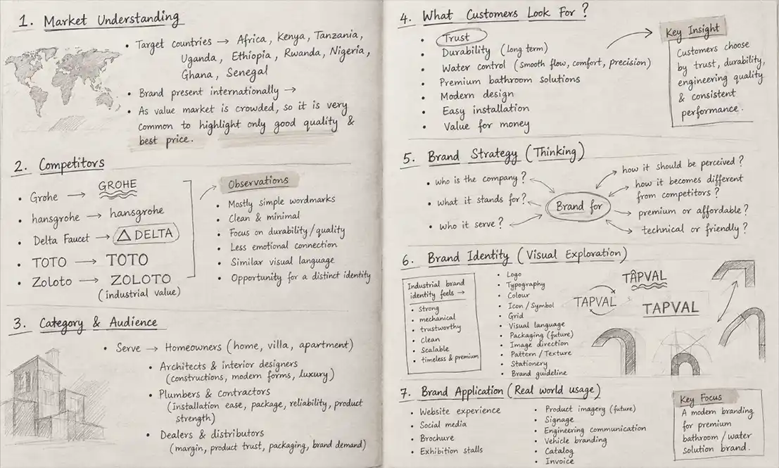
Our design process began with extensive industry research, stakeholder interviews and competitor benchmark analysis. We analyzed how decision-makers in the engineering and industrial sectors evaluate supplier credibility.
The discovery phase revealed a key insight: industrial buyers look for precision, structural integrity and proven reliability above all else. We defined TAP-VAL’s core brand pillars around Precision, Performance and Trust laying a solid strategic foundation for all visual storytelling that followed.
Concept & Exploration
During the exploration phase, we experimented with geometric forms, engineering schematics and fluid dynamics. The goal was to build an iconic symbol that directly represented TAP-VAL’s core offerings: valves, regulation and fluid control.
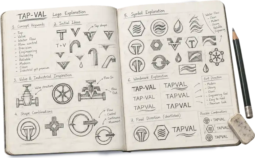
Through sketch-level ideation, we explored overlapping structural lines, tri-fold geometry and closed-loop flow systems. This meticulous process allowed us to refine abstract engineering concepts into a bold, memorable emblem that carries genuine strategic weight..
We pressure-tested every concept through multiple sketch iterations to ensure simplicity, distinctiveness, and technical relevance. This methodical exploration allowed us to filter out excess detail and craft a bold, scalable identity that aligns seamlessly with TAPVAL’s market positioning.
Brand Identity
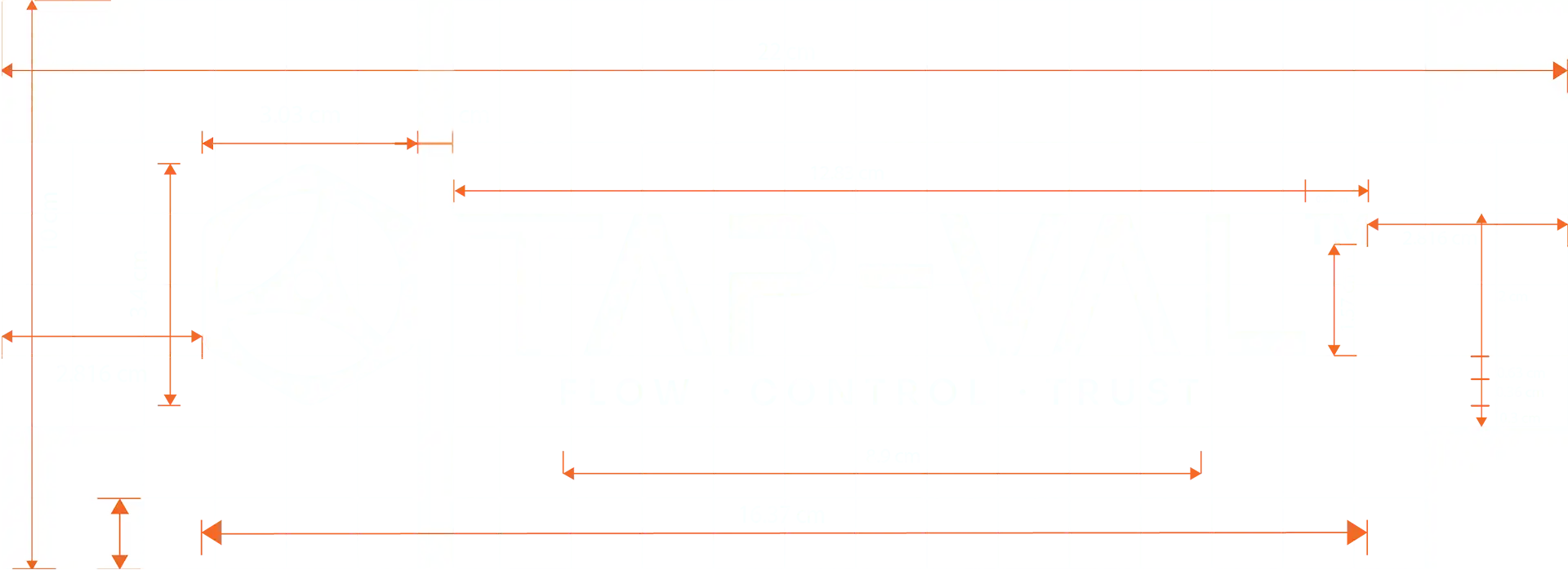
The final TAP-VAL brand mark combines structured geometric precision with modern minimalism. The symbol represents three key elements: total flow regulation, mechanical integrity and reliable partnership.
To ensure brand consistency across physical and digital touchpoints, we developed a comprehensive visual identity system:
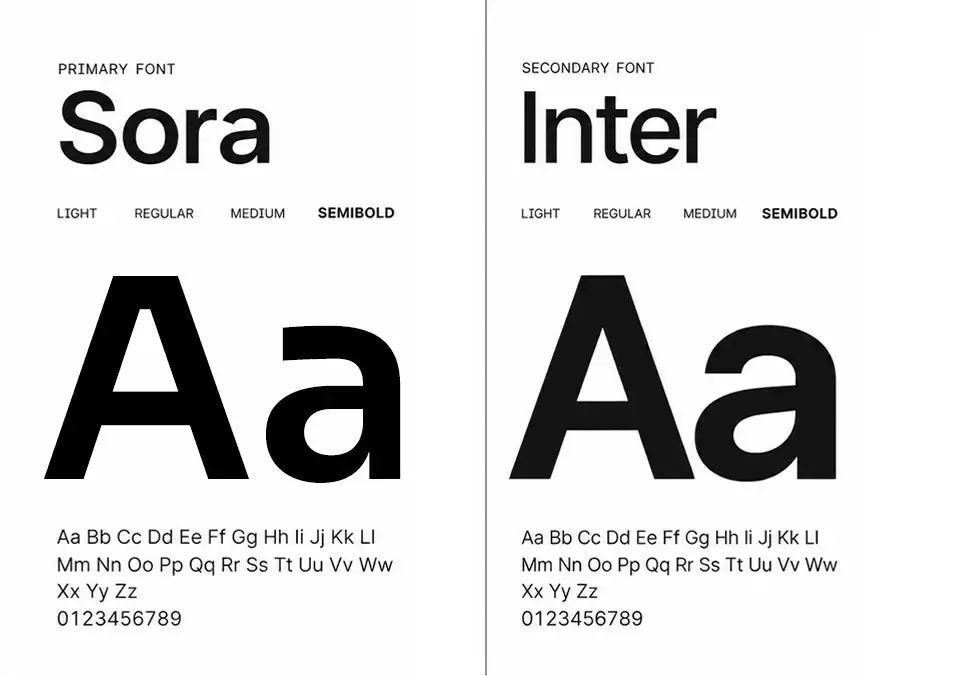
Typography:
Selected Sora for strong, geometric display headlines and paired it with Inter for clean, highly legible body copy.
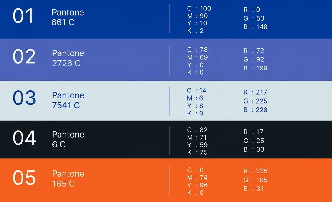
Color Palette:
Anchored by Deep Industrial Blue to communicate stability and technical depth, balanced with vibrant accent tones to bring dynamic energy to digital interfaces and marketing touchpoints.

Brand Applications
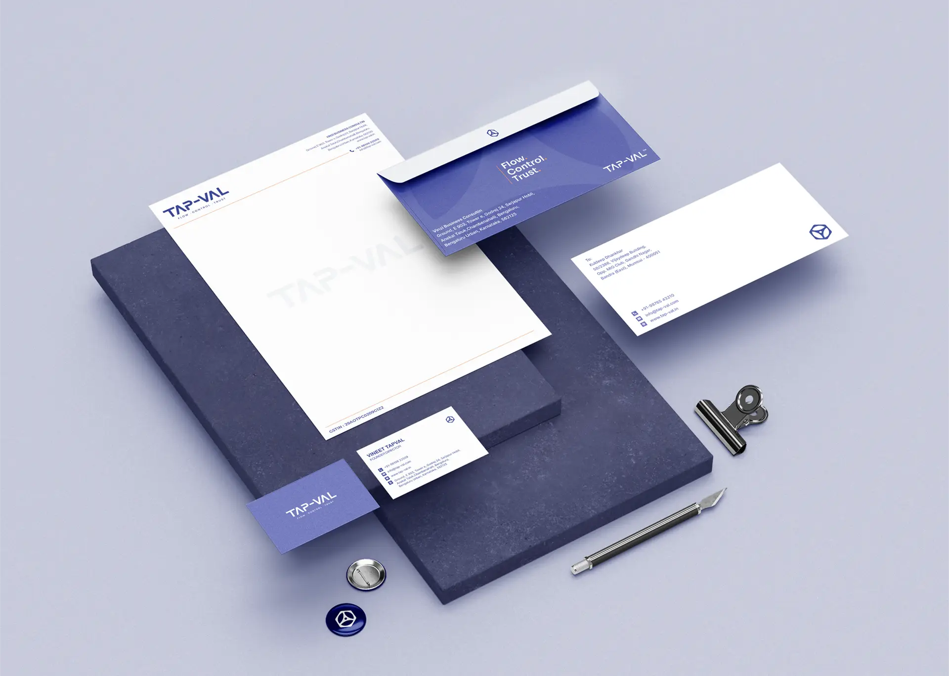
A great brand identity must perform seamlessly wherever it lives. We extended TAP-VAL’s visual system across every touchpoint to deliver a unified, high-impact brand experience:
Corporate Stationery & Deliverables: Professional letterheads, business cards, and project proposals designed to leave a lasting impression during B2B client meetings.
Digital & Social Presence: Cohesive social media templates, ad formats and digital banners optimized for technical trade audiences.
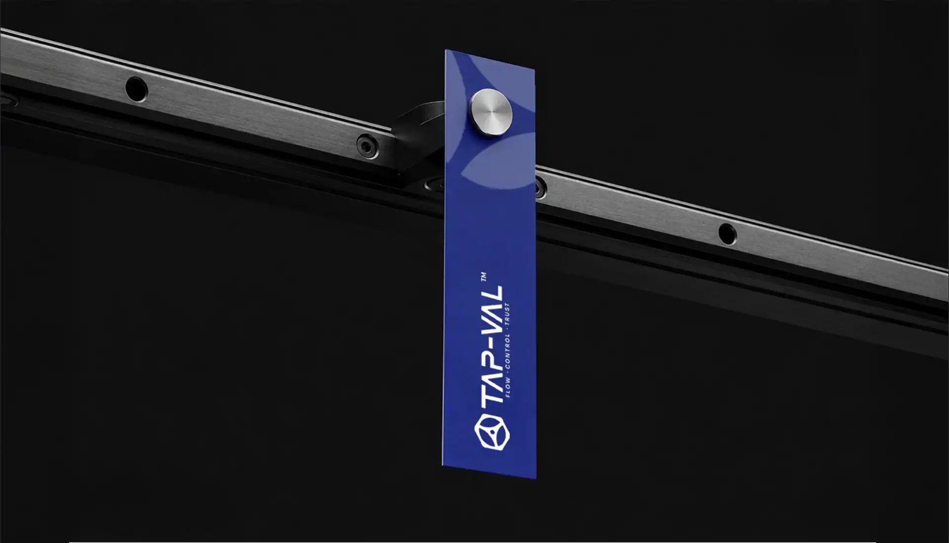
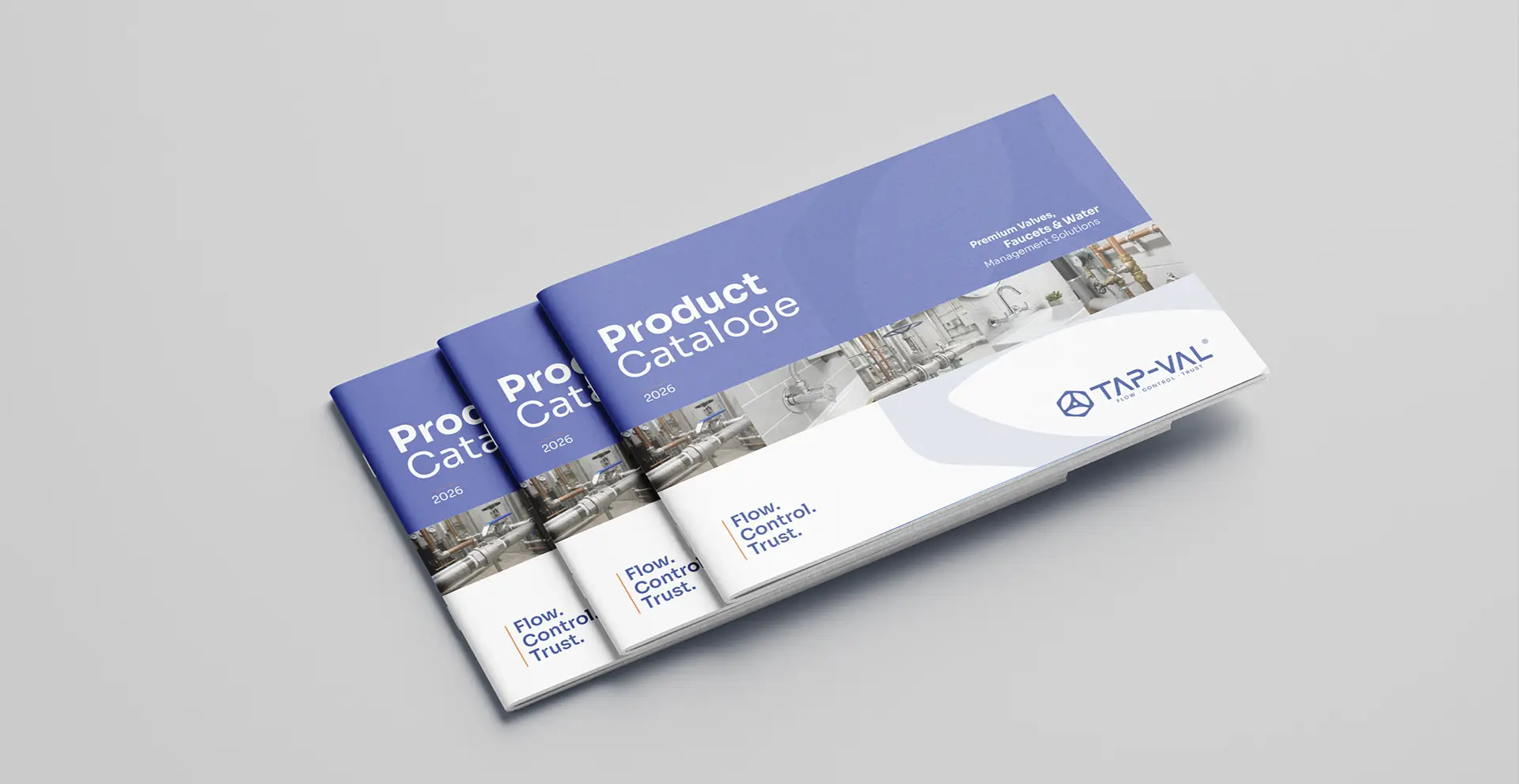
Print & Merchandise: Premium corporate brochures, promotional materials, ID lanyards and branded apparel.
Large-Format Outdoor Media: High-impact outdoor billboards, trade show booths and exhibition displays engineered for maximum visibility at industry expos.



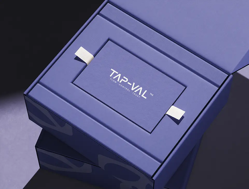

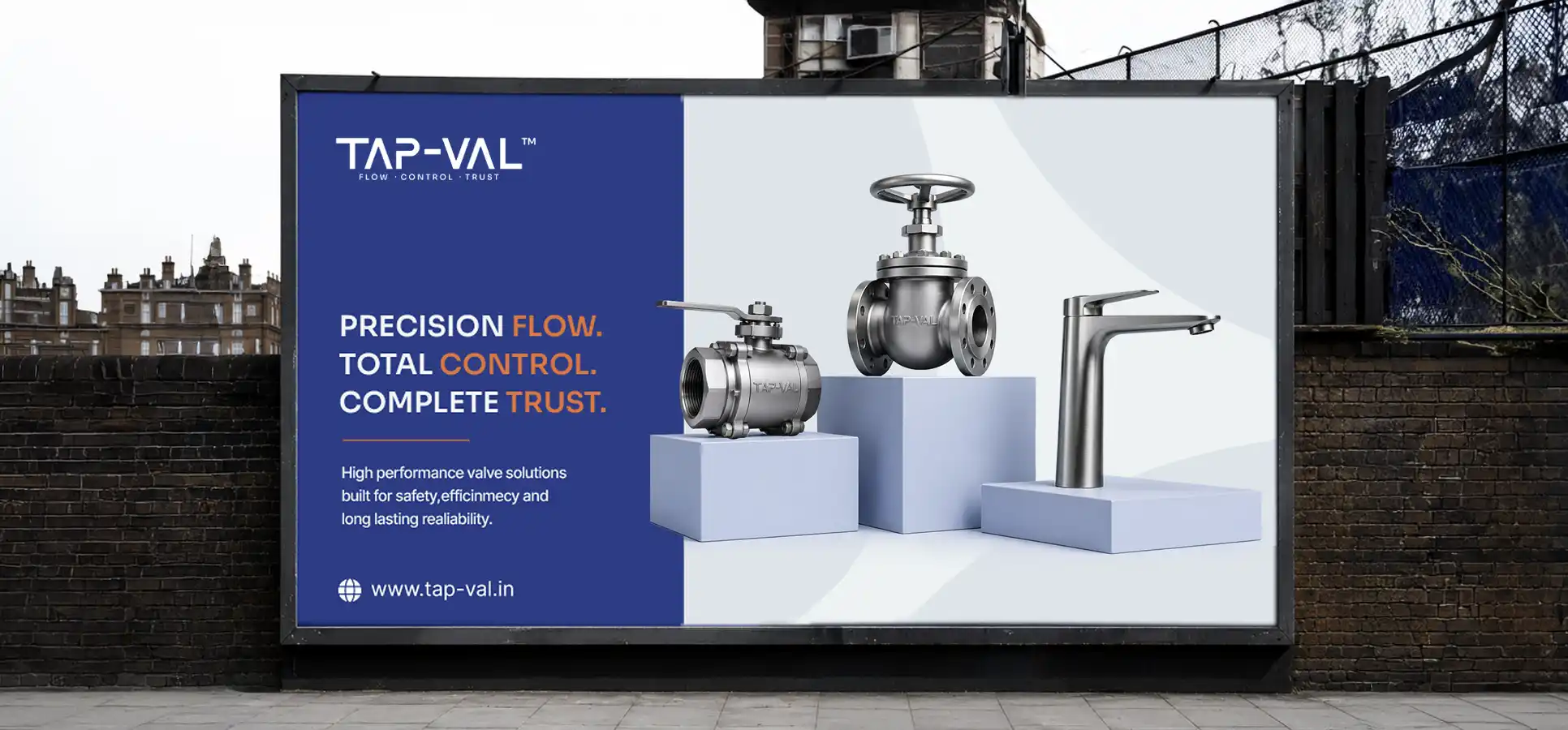
By combining deep strategic research with bold visual execution, Swaparichay Studios transformed TAP-VAL’s market presence into a modern, trusted industrial brand. The new visual identity gives TAP-VAL a distinct competitive edge, ensuring they communicate quality, precision and authority across every global market touchpoint.
A visual identity built to flow, control and build trust.