
Introduction to Sigma Trade Wings Rebranding
Sigma Trade Wings, LLP is a premier nationwide media solutions company with over 29 years of market leadership, specializing in high-impact advertising across OOH, DOOH, transit, and digital platforms. Swaparichay Studios was brought on board as the strategic creative partner to engineer a complete brand transformation—building a highly structured, scalable visual identity system that honors their massive operational footprint while aligning the agency with modern, digital-first media environments.
About the Project
-
SERVICESRebranding, Brand Strategy, Logo Architecture Design, Core Iconography, Layout & Typography Design, Visual Systems, Brand Guidelines.
-
STRATEGYCorporate Identity Restructuring, Brand Architecture, Multi-Platform Media Guidelines.
-
CLIENT
Project Overview
Sigma Trade Wings approached Swaparichay Studios with a clear, ambitious vision: to transform their legacy media footprint into a unified, world-class corporate brand identity. Operating across 3,000+ legally owned media sites and maintaining exclusive rights across 27+ strategic airports, the brand required a multi-disciplinary visual system that communicates structured visibility, legal compliance, and reliable operational scale.
Our team closely analyzed their massive cross-platform network—from physical billboards and digital kiosks to dynamic cinematic advertising ecosystems—to build an enduring corporate identity that effortlessly adapts to any scale.
Core Requirements
- Strong & Recognizable Market Presence: Elevating a 29-year legacy into a bold corporate identity that instantly commands authority.
- Structural Visual Discipline: Designing a cohesive visual identity system rooted in geometric forms that reflect corporate stability and precision.
- Cross-Media Adaptability: Creating a flexible design system that functions seamlessly across print, digital formats, large-scale OOH, and on-screen environments.
- Unified Brand Cohesion: Standardizing a clear framework for logo configurations, sub-brands, and internal assets.
- Corporate & Legal Credibility: Establishing a design language that reinforces compliance, transparency, and nationwide trust.
Concept, Approach & Planning
The Idea: Structured Visibility
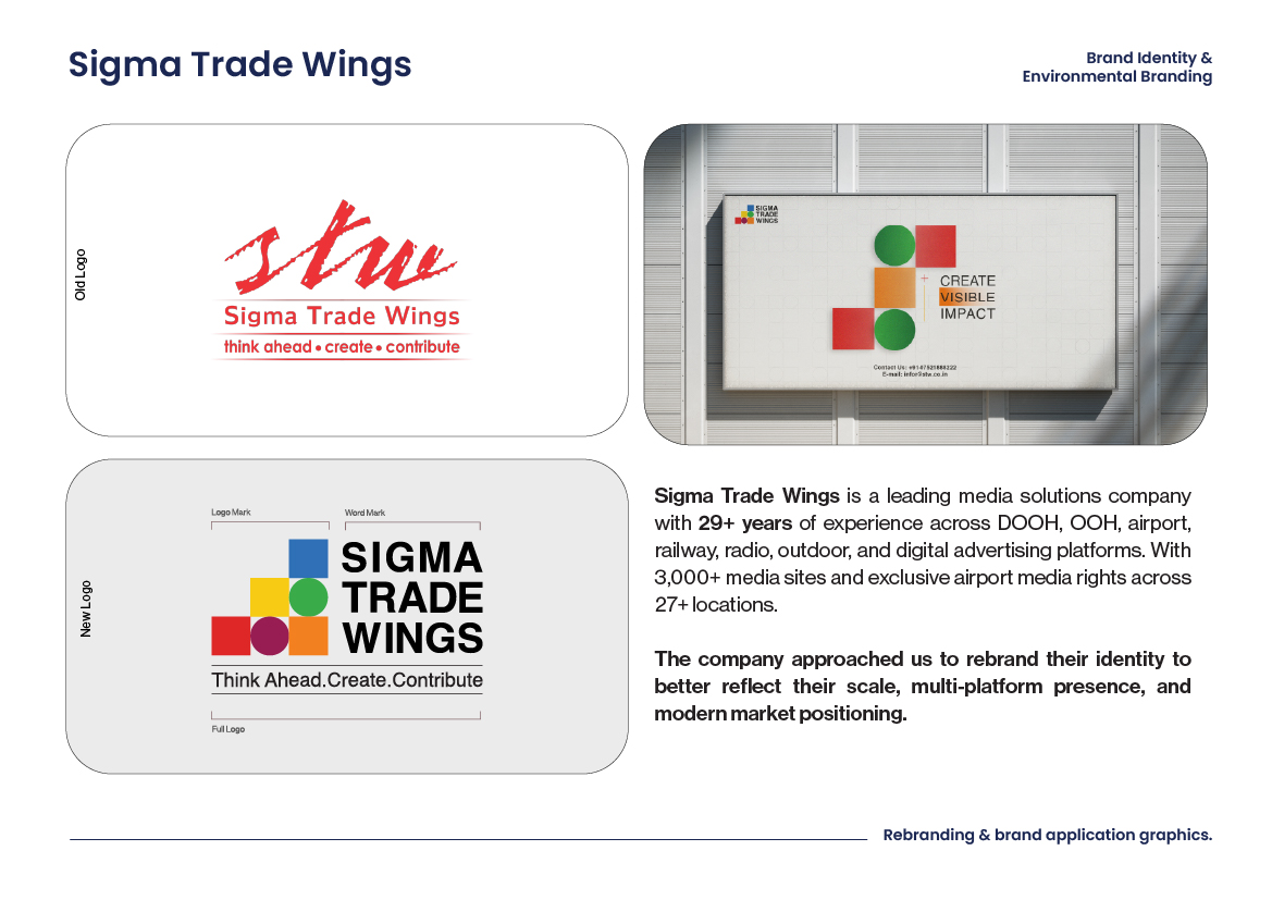
The core creative concept for the rebranding was built around "Structured Visibility." We designed a modular visual system based on a geometric staircase framework. This structure represents steady corporate ascension, analytical precision, and multi-faceted media integration. The brand's visual DNA is explicitly designed to perform—emphasizing that Sigma Trade Wings does not simply place advertisements, but creates a lasting footprint in public memory.
Methodology and Approach
Swaparichay Studios initiated an exhaustive brand audit of Sigma Trade Wings' multi-tiered media offerings. We consolidated their diverse platforms into core functional buckets, mapping out a phased brand rollout. By analyzing high-traffic public environments (airports, railways, and highways), we established strict visual guardrails to maintain legibility, contrast, and maximum brand recall across all touchpoints.
Core Execution Pillars
1. Rebranding & Logo Architecture
We engineered a clean, sophisticated multi-tier logo ecosystem. The master structure utilizes a balanced geometric layout composed of solid blocks and perfect circles, ensuring flawless proportions.
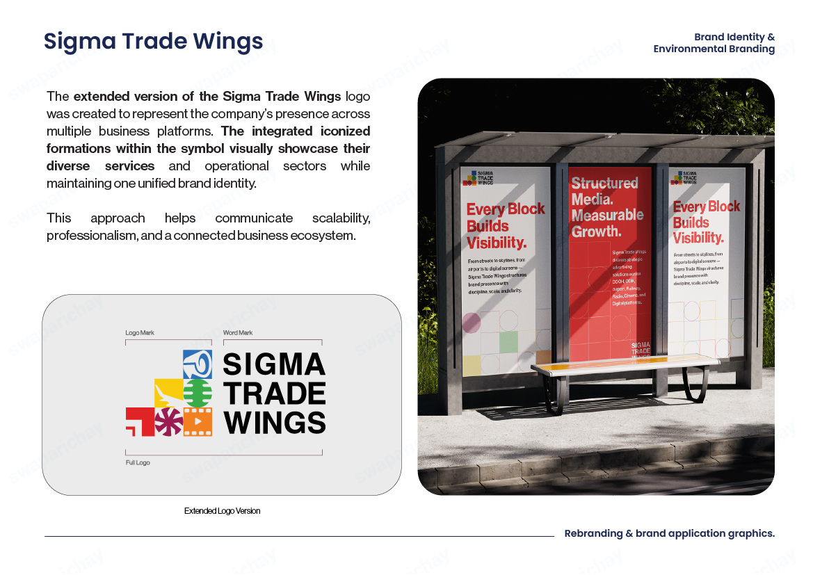
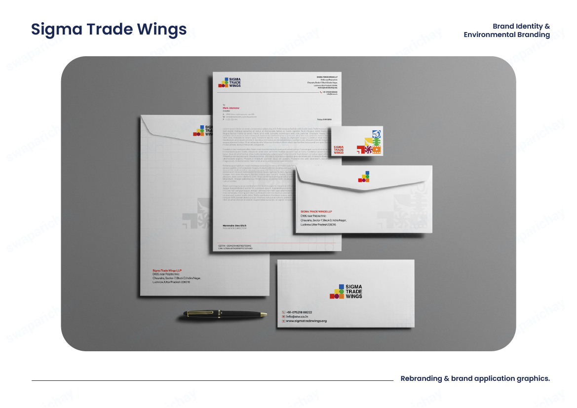
Primary Logo: Built using clean, plain geometric blocks to convey institutional strength, clarity, and professionalism. It serves as the official corporate signature for website headers, legal documents, presentations, and corporate stationery.
Extended Logo Version: A versatile system designed for creative storytelling. We carefully integrated custom media category icons inside the structural blocks without breaking the alignment of the master grid system.
2. Multi-Platform Media Iconography & Color Strategy
To give the brand absolute functional flexibility, we mapped their primary media categories into a strategic color-coded design matrix:
- Red — Signage & Outdoor Direction: Utilizes a directional icon to represent navigation and outdoor systems. Red highlights clear visibility and high ground impact.
- Purple — Creative & Photography: Utilizes a custom camera shutter icon to represent original storytelling and design execution.
- Orange — Cinema Advertising: Features a cinematic reel icon representing in-theatre media platforms, conveying entertainment and immersive experiences.
3. Corporate Typography & System Rules
We established strict brand guidelines specifying font hierarchies, clearing rules, and layout constraints. This comprehensive document acts as a single source of truth for vendors, internal media planners, and corporate stakeholders.
Perfect visual consistency is ensured whether the brand is deployed on a small corporate report or a massive digital billboard at an international airport terminal.
Workflow & Strategic Challenges
Transforming a massive legacy brand with a nationwide operational network presented unique challenges that required agile, strategic design engineering.
Consolidating Legacy Assets
Challenge: Aligning nearly three decades of media materials and varied regional signage into one cohesive aesthetic without losing brand equity.
Solution: Designed a modular design system that acts as an umbrella framework, allowing older media properties to transition seamlessly over time.
Scale & Form Adaptability
Challenge: A logo pristine on stationery can lose structural legibility when blown up onto a highway billboard.
Solution: Engineered the geometric mark specifically for mathematical scale with extensive multi-screen test rollouts.
Functional Visual Categorization
Challenge: Representing wide variety of services (transit, cinema, OOH, digital) under one banner without visual clutter.
Solution: Developed distinct split between Primary Logo (corporate trust) and Extended Version (creative storytelling).
Multi-Stakeholder Distribution
Challenge: Providing thousands of nationwide vendors with guidelines simple enough to prevent misaligned branding.
Solution: Created intuitive corporate Brand Book with concrete "Do's and Don'ts" and downloadable asset kits.
The Final Result
Brand Legacy
The transformed Sigma Trade Wings brand now stands as a unified, powerful corporate entity across their entire nationwide network. The system accommodates everything from premium executive presentations to massive outdoor installations, while maintaining perfect visual consistency and immediate brand recognition.
This rebranding has positioned Sigma Trade Wings as the modern, trustworthy leader in India's advertising infrastructure—delivering on their promise of "Structured Visibility" across every consumer touchpoint and media platform.