
About the Project
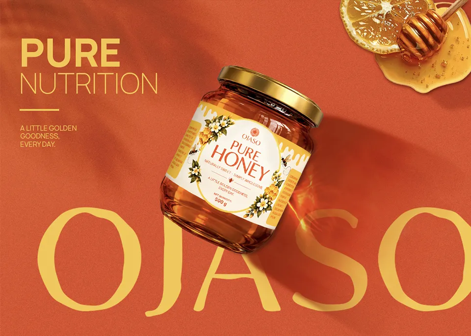
OJASO set out to establish a distinctive brand identity in the everyday nourishment space, moving beyond conventional visual language and generic packaging. The goal was to create a unique logo, explore a fresh colour palette beyond commonly used greens and blues and develop packaging that feels instantly recognisable. The brand identity brings together nature-inspired elements and modern Indian aesthetics, creating a cohesive visual system that communicates nourishment, warmth and simplicity across the entire product range.
The Logo Concept
Inspired by the sun and nature’s natural cycles, the OJASO logo symbolises energy, nourishment, growth and wellness. Its concentric organic rings represent the continuous cycle of nourishment, while the golden form expresses vitality, abundance and the power of nature.
Pure by Nature • Nourishing by Purpose
The Symbolism Behind the Logo
Natural Energy Represents vitality, strength and inner power inspired by nature.
The Sun Symbolises the universal source of life, energy and growth.
Continuous Nourishment Reflects the natural cycle of nourishment, renewal and well-being.


Visual Identity
The OJASO visual identity is designed to maintain consistency and recognition across all brand touchpoints. From packaging and digital platforms to print materials, every element works together to create a distinctive and memorable brand presence inspired by nature and everyday nourishment.
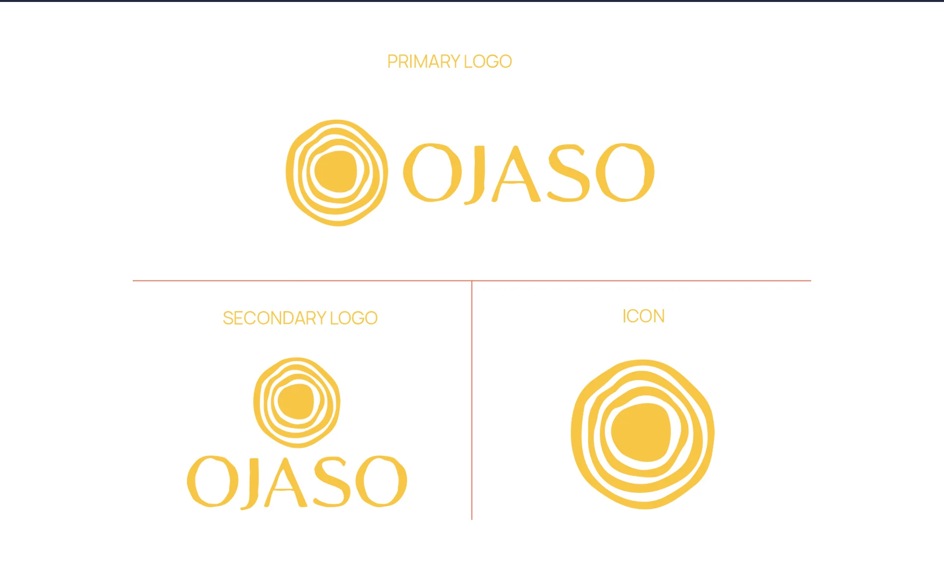
The main horizontal logo combines the brand symbol and wordmark, creating a clear and recognisable identity.
A stacked version of the symbol and wordmark, designed for compact layouts and spaces where flexibility is essential.
The standalone symbol offers a simple, distinctive and easily recognisable representation of the OJASO brand.
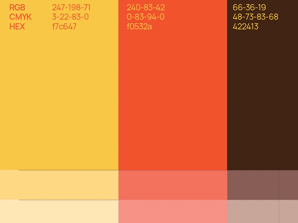
A warm combination of golden yellow, vibrant orange, soft cream and deep earthy brown creates a distinctive visual identity inspired by nature, sunlight and everyday nourishment.
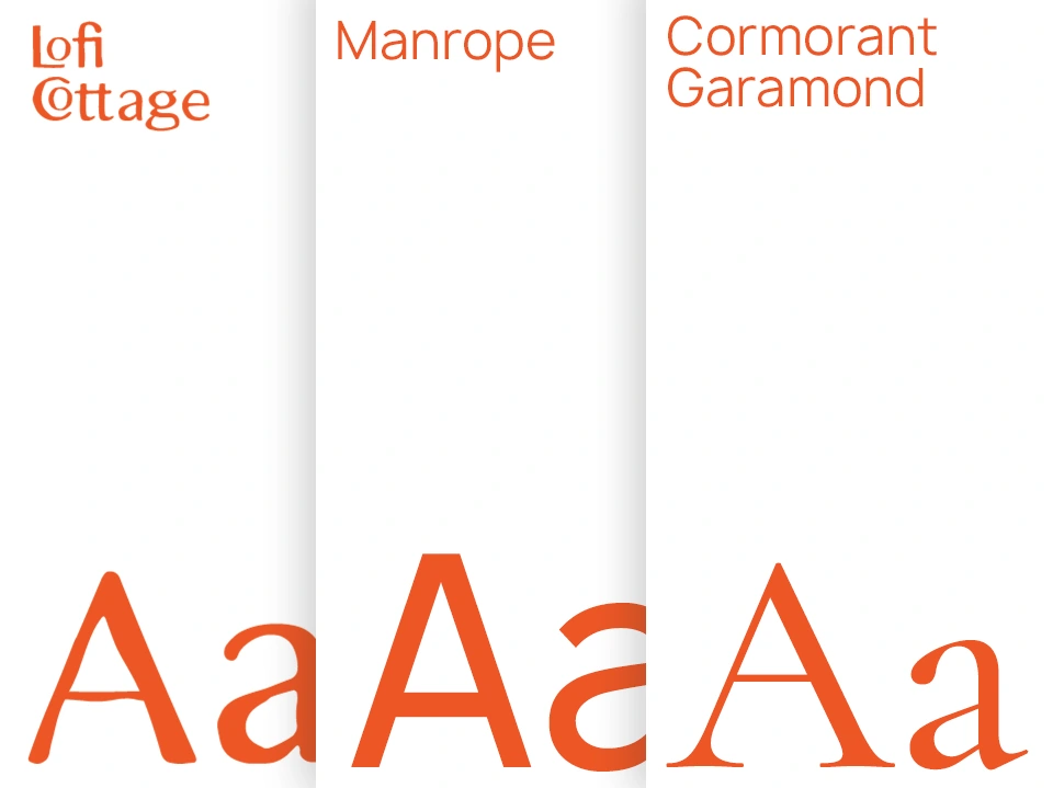
OJASO combines Lofi Cottage for its expressive logo with Manrope as the primary typeface for clarity and readability and Cormorant Garamond as the secondary typeface to add warmth and elegance.
Product Packaging
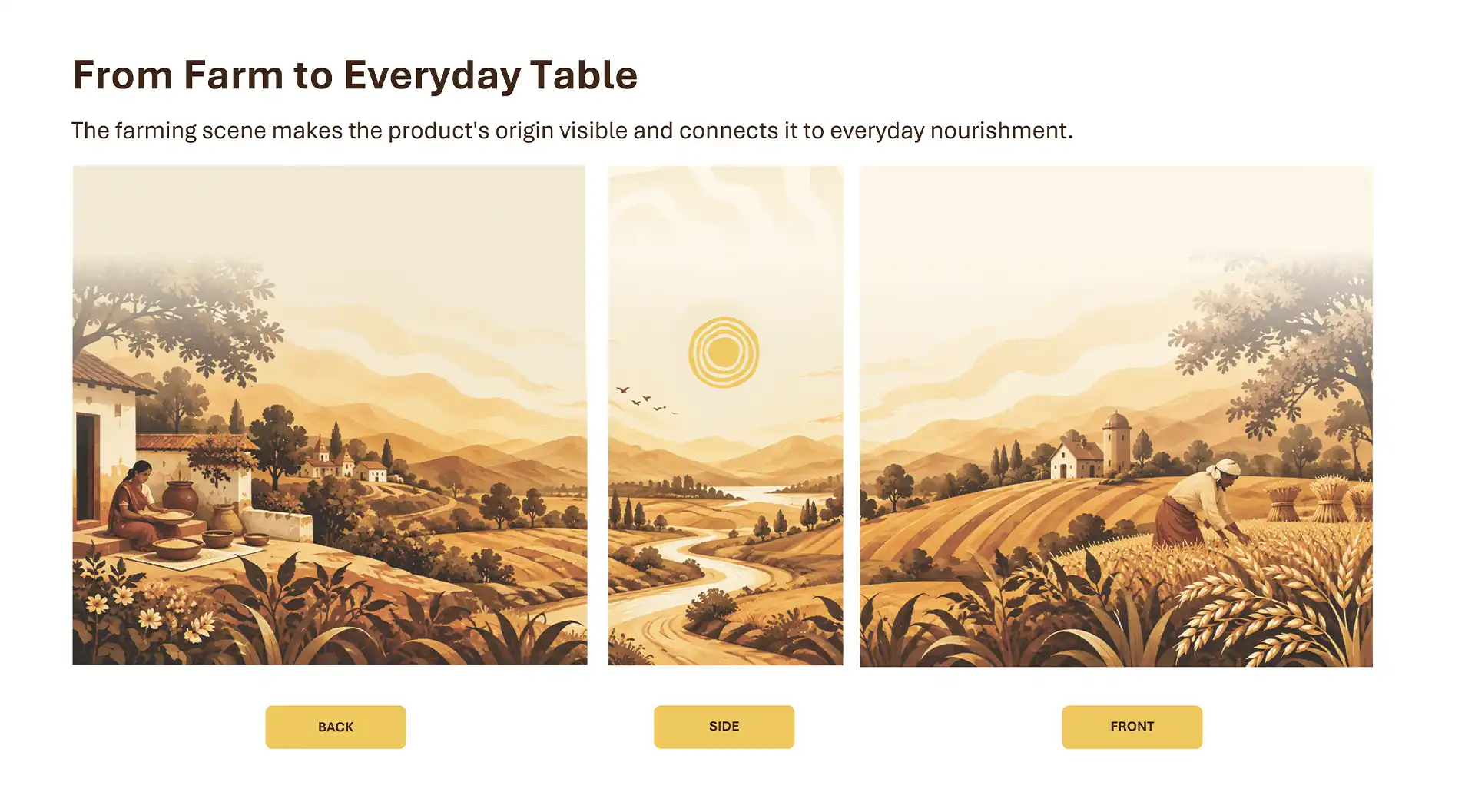
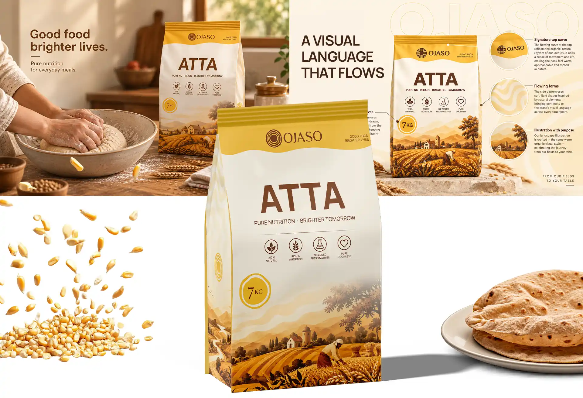
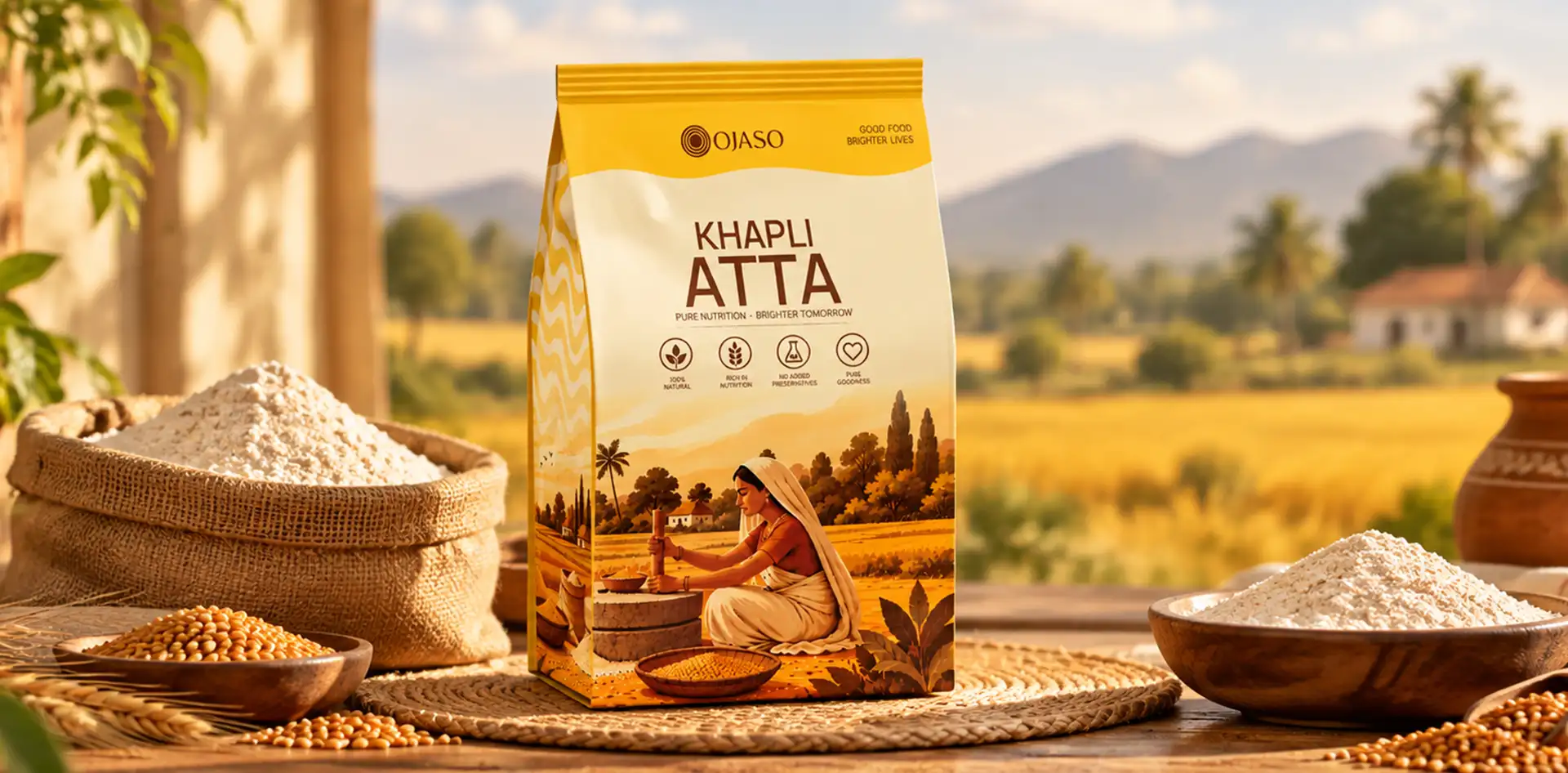
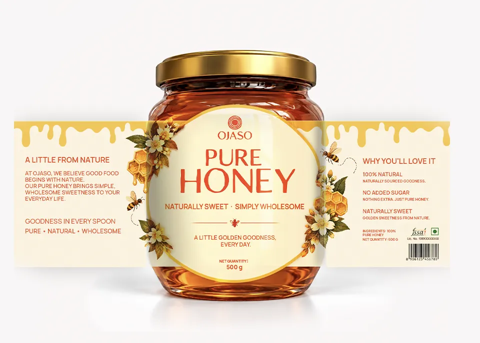
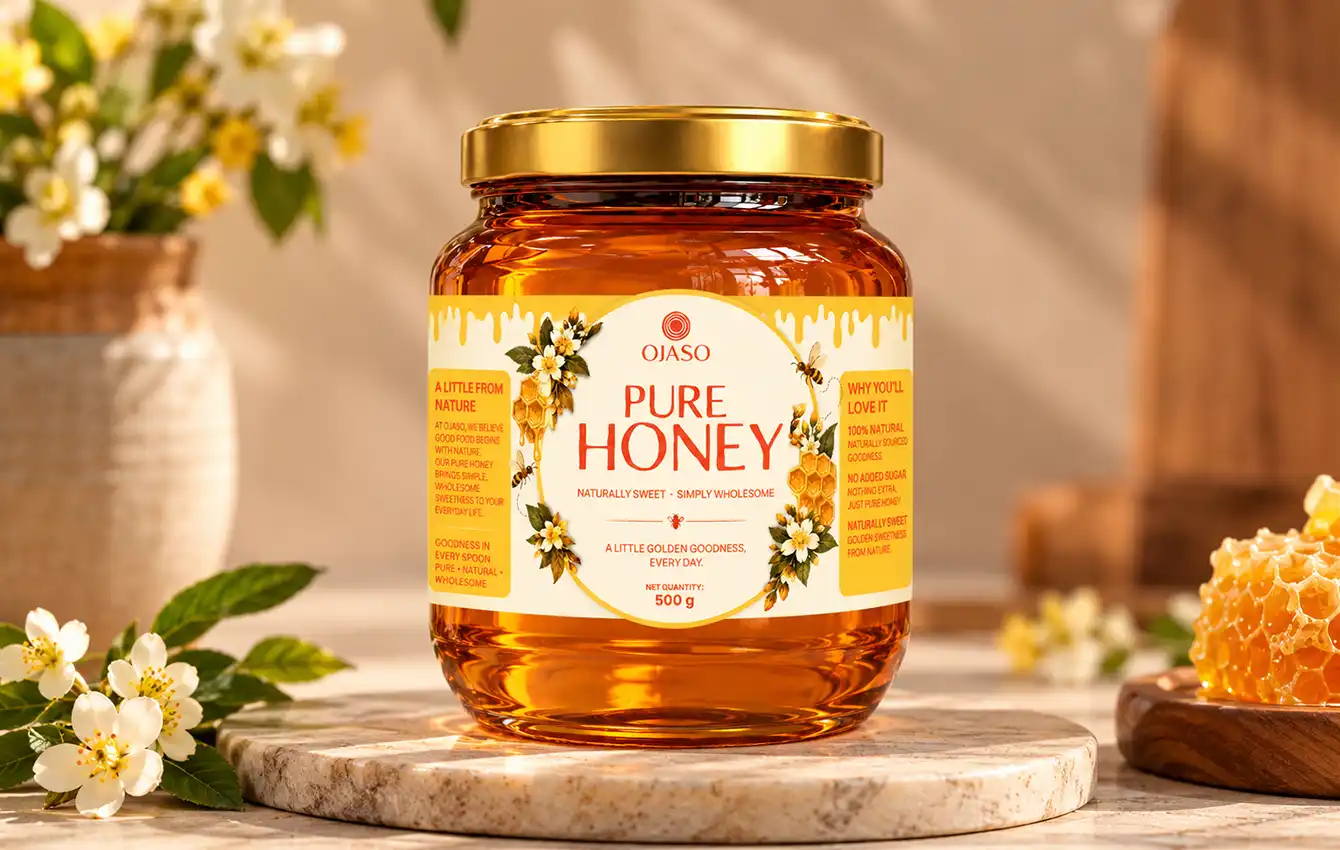
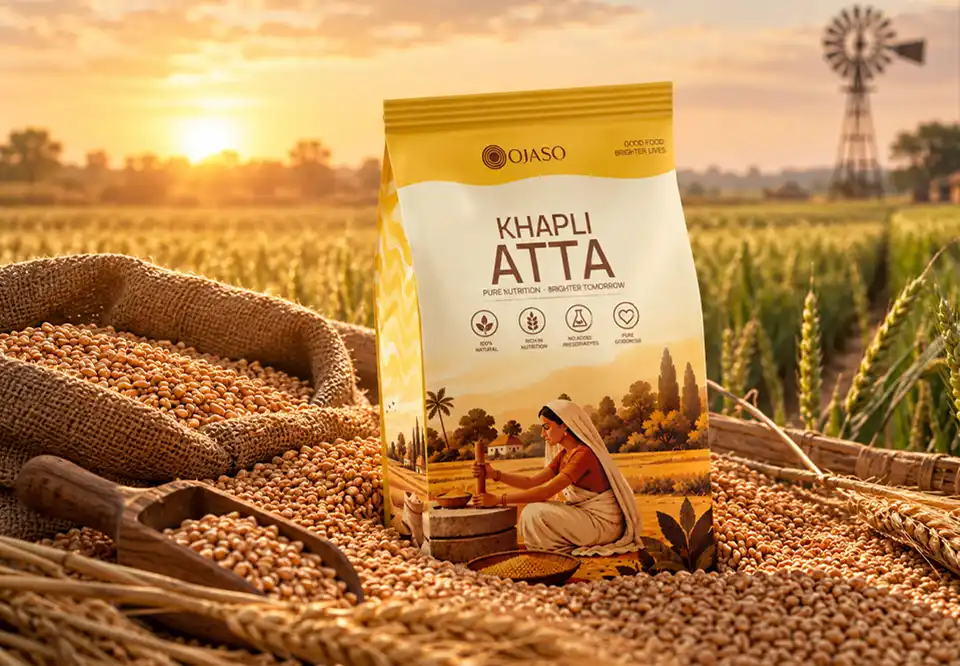
The OJASO product packaging is designed to create a consistent and recognisable brand identity across all packaging formats. By combining distinctive logo variations, carefully selected typography and a warm, nature-inspired colour palette, the brand communicates nourishment, quality and simplicity while maintaining a cohesive visual presence.
The horizontal logo combines the OJASO symbol and wordmark to create a distinctive brand identity for packaging and other brand applications.
The stacked logo brings the symbol and wordmark together in a compact format, making it suitable for packaging layouts with limited space.
The standalone symbol provides a simple and recognisable brand element that can be used across packaging, labels and other visual applications.
OJASO uses Lofi Cottage for its expressive logo, Manrope as the primary typeface for clarity and readability and Cormorant Garamond as the secondary typeface to bring warmth and elegance to the brand.
Golden yellow, vibrant orange, soft cream and deep earthy brown form a warm and distinctive colour palette inspired by sunlight, nature and everyday nourishment. These colours help create a consistent visual identity across product packaging and brand communications.